Thank you! Your submission has been received!
Oops! Something went wrong while submitting the form.
MENU
You poured your heart into creating an incredible online course. You’ve invested time, energy, and passion into crafting every module, perfecting every video, and planning every lesson. Yet, your sales page barely converts, 1,000 visitors but only 2 sign-ups. Frustrating? Absolutely. But here’s the good news: with a few high-impact UX improvements, you can transform that same page into a conversion powerhouse.
Let’s dive into seven proven UX strategies to supercharge your course sales page conversions. These tips aren’t fluff; they’re grounded in research, real-world examples, and best practices that Teachable makes easy to implement—no developer needed.
Visual hierarchy is the silent conductor of your sales page. It dictates where the eye goes first, second, and third—and ultimately guides visitors toward clicking that all-important “Enroll Now” button. Without a strong visual hierarchy, even the most compelling course content can get lost in the noise.
According to recent research, 88% of users are less likely to return to a website after a bad user experience. That means your course sales page design—especially your visual hierarchy—must be spot-on to keep visitors engaged and coming back
Start with a clear, commanding headline that immediately communicates your course’s value proposition. Use a larger font size, a bold weight, and a contrasting color that pops against the background. Think of it like a movie poster—your headline is the star.
Next, incorporate subheadings that reinforce the core message and break the page into digestible sections. Users scan before they read; subheadings act as signposts, pulling readers deeper into your page. Use high-quality images or a captivating video preview right under the headline to create an immediate emotional connection. Teachable’s embed functionality makes adding videos or GIFs a breeze, ensuring your visuals load fast and look professional.
Pay special attention to white space—don’t cram every element together. Let your design breathe. According to the Baymard Institute, crowded pages overwhelm visitors and cause them to abandon the buying process. Teachable’s intuitive drag-and-drop editor makes it easy to space out sections and adjust margins for a clean, conversion-focused layout.
Pro tip:
Above all, remember that every element—headline, subheading, image, button—should guide the visitor toward taking action. Keep your visual hierarchy tight and purposeful, and you’ll keep eyes glued to the path that leads to conversions.
You only have seconds to capture a visitor’s attention—and that’s where your above-the-fold content comes in. Above the fold is the portion of your sales page that’s visible without scrolling, and it’s your prime real estate for grabbing attention and communicating your course’s core benefits.
Start with a punchy headline that answers the question: “What’s in it for me?” This headline should be bold, benefit-driven, and laser-focused on the transformation your course delivers. Instead of “Mastering UX Design,” try “Transform Your UX Skills to Land Your Dream Clients—Fast.” See the difference? It’s all about clarifying the outcome.
Directly below your headline, consider adding a brief, compelling subheading that supports your main promise. Then, drop in a short video preview or hero image that instantly conveys quality. Teachable’s easy embed functionality lets you add these visuals without slowing down the page.
Avoid clutter. Every element above the fold should work together to reinforce your core message—no distractions, no mixed signals. Use concise copy and bullet-point highlights only when absolutely necessary, and always keep the focus on value.
Pro tip:
A contrasting color, clear language (“Enroll Now” or “Start Learning Today”), and strategic placement ensure visitors know exactly what to do next. Teachable’s mobile-first design ensures your above-the-fold content looks just as polished on a smartphone as it does on a desktop, so you never lose a potential student to a bad first impression.
Your call to action (CTA) is the bridge between interest and conversion—it’s the single most important element on your sales page. Yet, so many creators bury their CTA in a sea of text, cluttered visuals, or ambiguous language. Let’s fix that.
First, make your CTA visually distinct. Choose a button color that stands out from the rest of your page design, but still fits your brand’s aesthetic. If your page is predominantly blue and white, try an eye-catching orange or green CTA button. The key is contrast—it draws the eye and demands attention.
Next, use actionable, benefit-driven text. Skip the generic “Submit” or “Click Here.” Instead, think like your audience: what are they getting by clicking this button? Use phrases like “Start Learning Today,” “Claim Your Spot,” or “Get Instant Access.” These phrases create a sense of urgency and clearly communicate the reward.
Placement matters too. Don’t make visitors hunt for your CTA. Position it above the fold, after every key section, and especially after testimonials and social proof. Remember, decision points often follow trust points—users read a testimonial, feel reassured, and then look for the next step. Make that step easy.
Pro tip:
Teachable’s editor makes adding and customizing CTA buttons a breeze. Use the drag-and-drop functionality to test placements, experiment with different text, and even A/B test colors and positions if you’re feeling advanced. And on mobile? Make sure your CTA is thumb-friendly—Teachable’s responsive design ensures buttons are easy to tap, so your conversions don’t suffer.
Page speed is often overlooked, but it can make or break your course sales page conversions. A slow-loading page not only frustrates visitors, it directly reduces conversions. According to the Baymard Institute, a one-second delay in page load time can cost you up to 7% in conversions. Let’s not leave money on the table.
Start by optimizing images. Compress them without losing quality using tools like TinyPNG or ImageOptim. Teachable’s platform already does a great job of handling media files efficiently, but a quick compression step can give you an extra edge. Next, minimize the use of heavy scripts and plugins that slow down your page. Less is more when it comes to performance.
Browser caching and CDN support can also help. Teachable’s built-in optimization features mean you won’t need to tinker with complicated code—your pages are served fast, globally. But if you’re linking to external resources (like videos hosted elsewhere), ensure they’re optimized for fast delivery. Teachable’s video embed functionality is designed for speed, so use it whenever possible.
Pro tip:
Don’t forget mobile speed. Mobile users are even less patient than desktop users. A laggy mobile experience is a conversion killer. Teachable’s mobile-first layouts give you a head start, but it’s still wise to preview and test your page on multiple devices. Use tools like Google PageSpeed Insights to catch any bottlenecks and fine-tune accordingly.
Trust is the foundation of every purchase decision, especially in the digital world. Visitors who don’t know you or your course need reassurance before they hit “Enroll.” That’s where trust indicators come in—they’re the social proof and credibility boosters that tip the scales in your favor.
Start with testimonials. Highlight real success stories from your students—ideally with names, photos, and specific results they’ve achieved thanks to your course. Teachable makes it easy to embed these directly into your sales page, so don’t hide them in a separate section; weave them throughout your page, especially near CTAs.
Incorporate trust badges if you have them. These could be certifications, endorsements, or even security icons that signal safe transactions. While Teachable handles secure payments on its end, adding a simple “100% Secure Checkout” badge near the purchase button can boost confidence.
Video testimonials pack an even bigger punch. A short clip of a student raving about how your course changed their life can be incredibly persuasive. Teachable’s embed functionality lets you add videos quickly without slowing down the page.
Pro tip:
Don’t underestimate the power of social proof metrics, like student enrollment numbers or course ratings. A simple “Join over 1,500 students already learning” can push visitors from “maybe” to “yes.” Teachable’s integration with analytics tools lets you track and highlight these numbers, reinforcing your course’s popularity and credibility.
More than half of web traffic comes from mobile devices—ignoring mobile optimization is like turning away half your potential students. But optimizing for mobile is more than just shrinking your desktop design; it’s about creating a seamless, intuitive experience that converts.
Start with a clean, clutter-free layout. Mobile screens have limited space, so every pixel counts. Keep your headlines concise, your paragraphs short, and your visuals impactful. Teachable’s mobile-first layouts give you a head start by ensuring your page automatically adapts to different screen sizes without breaking your design.
Navigation should be effortless. Sticky navigation bars, collapsible menus, and prominent CTAs all contribute to a frictionless mobile experience. Teachable’s customizable templates let you implement these features without coding.
Touch-friendly design is non-negotiable. Buttons should be large enough to tap comfortably, with plenty of spacing to prevent accidental clicks. Teachable’s responsive editor makes it easy to adjust button sizes and padding so users can interact confidently.
Pro tip:
Don’t just focus on development—test rigorously. Preview your page on multiple devices, whether it’s smartphones, tablets, or even different browsers. Tools like BrowserStack or Teachable’s built-in preview functionality help you spot issues before they impact conversions.
A high-converting sales page isn’t a one-and-done project—it’s a continuous journey of optimization. That’s why tracking, testing, and iterating are critical to long-term success.
Start by integrating Google Analytics, Hotjar, or similar tools with your Teachable sales page. Teachable makes this easy with built-in support for external tracking tools. Monitor key metrics like bounce rates, average session duration, and conversion funnels to understand how visitors interact with your page.
Use heatmaps and scroll tracking to see where users drop off. If visitors aren’t scrolling past the hero section, your above-the-fold content might need more punch. If they’re clicking on images instead of the CTA, your visuals might be distracting.
Without a doubt, A/B testing is your best friend here. Experiment with different headlines, CTA texts, color schemes, and testimonial placements. Even small tweaks can yield big gains in conversions. Teachable’s flexible editor lets you make these changes easily, without needing a developer.
Pro tip:
Don’t forget to act on the insights you gather. Regularly review your analytics and refine your page based on real user behavior. A culture of continuous improvement keeps your sales page performing at its best—and keeps your conversions climbing.
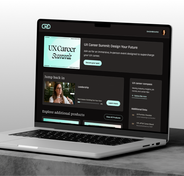
Teachable makes implementing these UX tips easier than ever. With its intuitive drag-and-drop editor, you can build and polish your sales page fast, no developer needed. Its mobile-first layouts ensure your page looks fantastic on every device, and the platform’s integrated data features let you seamlessly connect tools like Google Analytics.
Teachable also supports embedding videos and social proof elements, while offering robust product customization options. With features like external page support, Zapier/API tracking, and conversion clarity, Teachable helps you remove friction from the buying journey and maximize your sales page performance.
Your course sales page is more than just a digital flyer—it’s your online storefront, your brand ambassador, and your most powerful conversion tool. With these seven proven UX tips, you’ll transform that page from good to great, turning curious visitors into eager students.
Don’t settle for average. Build smarter, not harder—launch your optimized sales page on Teachable today and watch your course conversions soar.
