Thank you! Your submission has been received!
Oops! Something went wrong while submitting the form.
MENU
Timelines, tactics, and templates for educators ready to turn a new course into a successful launch.
Building and selling courses as a content creator isn't what it used to be. The pre-COVID strategies that worked in 2019 are flopping in 2025.
The platforms have evolved. The economics have shifted. And most creators are trapped in feast-or-famine launch cycles, watching their Google traffic disappear overnight while competing with AI.
Here’s the problem:
Even six-figure creators are hitting revenue ceilings, while rocky reach across platforms is creating income roller coasters that burn out entrepreneurs.
But a select group of creators are quietly conquering this chaos.
They aren’t stopping at building a single flagship course, they’re building product ecosystems.
They've moved past the "set it and forget it" passive income pipe dream to create sustainable businesses that bridge the creator economy with mainstream business principles.
Here’s what we’ll cover in this article:
Get The Modern Course Creator Playbook
{{trial-component="/blog-shortcodes/blog-cta"}}
The Wild West era has ended for online education.
What replaced it? A mature market where only the most strategic creators survive.
According to Goldman Sachs, the creator economy is expected to roughly double to $480 billion by 2027, up from about $250 billion in 2023, but only 9% of independent creators earn more than $100k annually, with 71% earning less than $30,000 per year.
Put simply: Most creators are overworked and underpaid.
You can double your subscribers, followers, or views and still see your income stay flat.
You can also have a small, highly engaged audience of 1,000 people and hit six figures (or more).
Over the past several years, savvy creators have shifted from making most of their money from brand deals, sponsorships, and ad revenue to diversifying to digital products; which, for what it’s worth, is great.
The problem is that having a large audience and providing a valuable digital product, doesn’t equal sales. Unless you have a pinpoint process for aligning product market fit.
The math that made course creation profitable during the pandemic no longer works.
Rising ad costs, declining organic reach, and plummeting trust have created a perfect storm that's destroyed the traditional "build it and they will come" model.
What we're witnessing now is a fundamental restructuring of how content creators need to run their online businesses. Here are four of the most pressing problems:
According to a Focus Digital 2024 analysis, uncertainty in the US economy has spared no industry from rising customer acquisition costs.
What used to cost $20-50 per lead now costs $200-300 in many niches (a 400-600% increase) that has made traditional volume-based models financially impossible.
Average online product conversion rates typically hover around 1.5-2%, meaning to earn just $5,000/month with a $99 course, you need 4,200 unique visitors monthly to a conversion-optimized sales page.
Most creators simply don't have that level of consistent traffic.
Instagram organic reach has plummeted to just 7.6% per post, while Facebook’s sits at an abysmal 1.2%.
Even worse, some creators dependent on SEO and Google search traffic have lost over half of their traffic from AI disruptions and algorithm changes.
Social media is flooded with complaints about "courses that don't work" and "another guru trying to get rich quick."
The promise of passive income through course sales has been so oversold to the point that many potential customers are now skeptical of almost any educational offer.
AI has accentuated this trend, with people no longer willing to pay premium prices for information they could find for free on YouTube or ChatGPT.
So should you give up? Not at all. But you do need to pivot.
Creators that are living their best lives right now aren’t tweaking a broken model. They've abandoned it entirely.
Instead of chasing passive income through high-volume, low-priced course sales, successful creators have shifted to portfolio-based business models that prioritize depth over breadth.
Instead of selling $27 courses to thousands of people, some top creators now offer $1,997-$4,997 coaching programs to smaller cohorts.
Others use the power of their audience to land B2B deals where they can sell dozens, or even hundreds, of their courses to a single customer.
More creators combine self-study content with live calls, community access, and direct mentorship, creating an experience that justifies premium pricing for better profit margins.
Smart creators now offer multiple touchpoints: Free lead magnets, low-ticket introductory courses ($47-$197), mid-tier comprehensive programs ($497-$997), and high-ticket coaching or done-for-you services ($2,000+).
This portfolio allows them to serve customers at different commitment levels while maximizing lifetime value (LTV) per customer.
The most successful creators have shifted from "here's what I know" to "here's what to do next, and I'll help you do it." They sell outcomes and accountability, not access to content.
While AI threatens information-based courses packed with dense content, forward-thinking creators use it to scale their personal touch.
They use AI to handle routine questions, create personalized learning paths, and generate supplementary content, freeing them to focus on high-value coaching and community building.
Not every business model works for every creator.
Your expertise, experiences, and more importantly, personality actually determines which monetization strategies will feel natural and sustainable for you (and which ones will lead to burnout, frustration, and ultimately failure).
After analyzing successful creators across different niches and revenue levels, we've identified four distinct creator archetypes, each excelling with completely different approaches to building and scaling their businesses.
The most successful creators build business models that lean into their natural tendencies while addressing their inherent weaknesses.
Each of the four archetypes below comes with a complete business blueprint, specific product ecosystems, pricing strategies, revenue expectations, and step-by-step implementation plans.
More importantly, each taps into different natural tendencies, so you can stop forcing square pegs into round holes and start building around your authentic self.
As you read each archetype, take note of which one makes you stop and think “This is me.” The goal isn't to force yourself into a box, but to select the business model that will feel like the most natural extension of who you already are.
A quick note before you dive in: You might see yourself in multiple archetypes; that's completely normal! Most creators have elements of two or three types.
Ready to find your match? Let's break down the four creator archetypes that work in 2025.
If people constantly ask you for your 'day in the life' videos get flooded with questions about your favorite products, you might be a natural-born trendsetter.
Trendsetters win by authentically inspiring others first, then backing up their lifestyle with systems and products that help others create their own version of success.
You've built a personal brand around your lifestyle and lived experience. Your content feels like insider access to your best friend's perfectly curated life (the friend everyone secretly wants to be).
Your superpower is relatability at scale. You're comfortable being vulnerable about struggles while showcasing wins, sharing both Instagram-worthy moments and 3 a.m. anxiety spirals.
You're ready to monetize when:
Affiliate marketing and brand partnerships ($500-$2,000+ per post) from authentic product recommendations that align with your values.
Entry-level digital products ($7-$297) like life frameworks, habit trackers, travel templates, and productivity guides based on systems you actually use.
Transformational programs ($497-$4,997+) such as "Design Your Dream Life" or "The Intentional Living Blueprint"—positioning these as transformation partnerships with live calls, community access, and accountability.
Physical products ($5-$500+) like custom planners, wellness products, or curated subscription boxes that let your audience bring your lifestyle into their daily lives.
Whitney Freya transformed her personal creative journey into a "life as art" philosophy, she hosts multiple programs on Teachable from art instruction to Creative Frequency Coach certification, building passionate communities around living creatively.
Michael from Inspire Your Success built his business around his morning routine transformation. His "Win the Morning" course helps others take control of their days through the authentic story of his shift from chaotic mornings to structured success, supported by his podcast and community testimonials.
The trendsetter model works because people crave authentic human connection in an AI-saturated world. Your lifestyle becomes the bridge between where your audience is now and where they want to be.
When colleagues consistently turn to you for training and expertise, you've found your calling as a Maestro.
Unlike creators who inspire through lifestyle or personality, Maestros build businesses around systematic knowledge transfer. You succeed by creating rigorous educational programs that develop actual competency in your students.
Your authority comes from years of hands-on experience in a specialized field. You've mastered complex subject matter that others struggle with, and you have a natural ability to break it down into www.teachable.components.
Teaching gets you excited. You get satisfaction from watching students progress from confusion to mastery, and you naturally think in curriculum terms: Prerequisites, learning objectives, skill progression.
You're ready to monetize when:
Comprehensive foundational courses ($197-$797) covering essential knowledge with structured modules, assessments, and progressive skill building.
Professional certification programs ($997-$2,997) that establish credentialed expertise and meet industry standards for advancement.
Intensive cohort programs ($1,497-$4,997) featuring live instruction, peer interaction, and direct mentorship throughout the learning process.
Custom corporate education ($5,000-$25,000+) developing specialized training curricula for organizations and professional development teams.
Speak Norsk built their Norwegian language school using systematic curriculum design and structured learning paths. With over 14,000 students on Teachable, they've created comprehensive programs from beginner to business-level Norwegian, helping students achieve measurable outcomes like language certification and successful relocation to Norway.
Dan George from FlightInsight draws on extensive aviation experience to educate flight professionals. His detailed courses cover complex operational procedures, regulatory compliance, and advanced flight systems that pilots need for career advancement.
Brian Kouhi from TOAnimate Academy leverages his professional animation experience from Netflix productions to create powerful education programs. After working with over 400 artists and identifying gaps in quality animation education, he built a structured curriculum that has generated nearly $300,000 in sales while helping aspiring animators develop industry-ready skills.
Maestros thrive because accessible quality education remains scarce. Organizations and individuals will pay premium prices for structured learning that builds genuine expertise rather than surface-level familiarity.
Got a business that's crushing it right now? People begging for your exact playbook? You're probably a Trailblazer.
Trailblazers monetize by teaching the systems they're actively using to generate results today. No theoretical frameworks or outdated strategies. Rather, they provide battle-tested processes from someone still in the trenches.
Here's the thing about Trailblazers: You're not teaching outdated strategies that worked five years ago. You're sharing what's working this quarter, this month, maybe even this week. You run an active business or hold a current role where you're implementing the exact strategies you teach.
People want your current playbook because they can see your recent results. You're documenting the journey while you're on it, not looking back from the finish line.
You're ready to monetize when:
System blueprints and templates ($197-$497) featuring the exact tools, spreadsheets, and processes you're currently using to get results.
Current method courses ($997-$2,997) walking people through your active systems with real-time case studies and behind-the-scenes documentation.
Done-with-you implementation ($2,997-$4,997) where you help others apply your current systems to their specific business while you're still refining them.
Live corporate workshops ($10,000-$50,000+) teaching companies your proven methodologies that are generating results in today's market.
Jack Appleby built his social media strategy business while actively growing his own accounts. He pre-sold his first course for $45,000 in 30 days by teaching the exact systems he was using to grow Future Social to 250,000+ followers. Instead of outdated tactics, Jack shares current content strategies as he implements them across LinkedIn and Twitter.
Abagail Pumphrey from Boss Project teaches business systems while running her own multi-seven-figure education company. With over 30,600 students and millions in revenue generated through Teachable, she shares the exact frameworks she's currently using to scale Boss Project, including her 388 digital products and systematic approach to sustainable business growth.
Dara Denney launched Performance Creative Accelerator after identifying gaps in Facebook and TikTok advertising while working as a performance creative consultant. She built and launched her course in just 60 days, growing to over 325 students by teaching the current ad creative strategies she actively uses with major brands.
The Trailblazer model works because entrepreneurs want proven systems from someone who's using them now, not yesterday. Your active implementation becomes proof that your methods work in today's market conditions.
When you naturally bring people together around a shared mission and they keep coming back for the community you've built, you're operating as a Lighthouse.
Lighthouses succeed by creating spaces where people with common goals, challenges, or interests can connect, learn from each other, and grow together. Your courses become the catalyst for community, but the real value lies in the relationships and transformations that happen within your ecosystem.
Community happens organically around you. People don't consume your content and leave; they stick around, engage with each other, and form lasting connections. You're naturally good at facilitating environments where others feel safe to share and grow.
Your mission extends beyond individual success to collective transformation. You're driven by the impact you can create when people support each other.
You're ready to monetize when:
Community-centered courses ($297-$997) that include group components, peer feedback, and collaborative projects where learning happens through interaction.
Membership communities ($47-$197/month) offering ongoing access to a supportive network, regular events, and exclusive content designed to foster connections.
Cohort-based programs ($997-$2,997) with live sessions, group coaching, and structured peer interactions that build lasting relationships among participants.
Live events and workshops ($197-$797) that bring your community together in person or virtually for deeper connection and collaborative learning experiences.
Jenny Rushmore built Sloper School into a transformative community of nearly 3,000 women learning to sew clothes that fit their bodies perfectly. Beyond teaching technical skills, she's created a body-positive space where students support each other through fitting challenges, celebrate successes together, and find belonging in a community that understands their struggles.
Brett Dashevsky founded Creator Economy NYC, connecting thousands of content creators through consistent in-person events and collaborative opportunities. Rather than merely teaching about the creator economy, he's built a thriving network where creators find collaborators, mentors, and friends while growing their businesses together.
The Lighthouse model thrives because people crave authentic connection and shared growth. Your community becomes the destination, with your expertise serving as the foundation for meaningful relationships that transform lives.
Now that you know which creator archetype fits your natural strengths, it's time to transform that knowledge into a thriving course business.
The difference between creators who succeed and those who struggle isn't just about having great content; it's about building systematically from a foundation that aligns with how you naturally work.
Here's your step-by-step roadmap to turn your archetype into sustainable income.
Before you build anything, confirm there's demand for what you want to teach. You don’t need the perfect idea, you just need to prove people will pay for your product.
Start by surveying your current audience with specific questions about their biggest challenges in your area of expertise. Don't ask "Would you buy a course about X?" Instead, dig deeper:
The responses will reveal exactly what your archetype should focus on. Run a simple pre-sale or waitlist to gauge real interest. If you can get at least 25 people to commit financially or join a waitlist, you've validated demand.
Ready to turn your idea into income with an audience validation template?
Get instant access to the free 10-day Teachable co:pilot course.
Your technical foundation should match how your archetype naturally operates, and your first course should deliver one specific transformation aligned with your strengths.
Different archetypes need different platform features and course structures:
Teachable's complete getting started guide walks you through the technical setup process, while Teachable's AI course creation tools can help you structure your curriculum quickly.
Your archetype determines which features to prioritize and how to configure your school for maximum impact.
Your pricing strategy should reflect how your archetype creates value, not market averages. Each archetype can command different price points because they deliver different types of transformation.
Here's how to price according to your archetype's strengths:
Our pricing guide covers the fundamentals, but remember that your archetype's unique value lets you price above market rates when you deliver aligned experiences.
Your business model determines your tool requirements. The right tech stack amplifies your strengths while automating tasks that drain your energy.
Different archetypes need different technical approaches, and Teachable's flexibility lets each archetype build exactly what they need:
The best course platforms adapt to your existing workflow rather than forcing you to learn entirely new systems.
Teachable connects with tools through Zapier, offers a public API for custom integrations, and includes a WordPress plugin and product embeds, letting you build a unique tech ecosystem around your teaching style.
Your tech stack should feel like an extension of your expertise, not a barrier to sharing it.
When your tools work together, you spend more time creating transformations and less time managing tech.
Your marketing should feel natural and sustainable for your archetype. Fighting against your natural tendencies leads to burnout and inconsistent results.
Your marketing approach should feel natural and sustainable for your archetype.
Fighting against your natural communication style, content creation habits, and audience engagement preferences leads to burnout and inconsistent results.
Think about it this way: If you're someone who loves deep, detailed conversations, you'll struggle trying to create snappy TikTok videos all day.
If you're energized by real-time sharing and quick updates, you'll feel drained writing long-form thought leadership articles multiple times a week.
The good news? You don't have to figure out all the technical marketing stuff on your own. Teachable automatically generates SEO-friendly sales pages (Product Detail Pages) from your course content, so your courses can actually rank in Google search results without you building custom websites.
Teachable also automatically creates a professional course storefront (known as the Browse Products Page page) from your existing course content.
The most important thing is that you align your marketing with your personality:
Focus on the marketing methods that align with your archetype's natural strengths. Your authentic approach will always outperform forced tactics that don't match your working style.
Your best customers are your existing customers. Your first sale is just the beginning of a relationship that should grow more valuable over time.
Student success drives your business success. When students complete your courses and see real results, they become your best marketing assets and most reliable revenue source.
The secret is to create an experience that students can't help but love.
Here's how to turn one-time buyers into lifelong customers:
The goal is to produce a student transformation that leads to word-of-mouth referrals, repeat purchases, and the capacity to scale your business by increasing the amount you make per customer compared to the amount it costs you to acquire a customer (LTV:CAC).
As you grow, the temptation is to become everything to everyone. Resist this. Your archetype is your competitive advantage, and scaling means doing more of what works, not diluting your core strengths.
Build an ecosystem that serves your archetype's audience at multiple levels:
Remember that each course in your portfolio becomes a discoverable asset.
Teachable automatically creates public course pages that rank in search engines, turning your course catalog into an organic marketing engine that works while you sleep.
The creators thriving in 2025 aren't the ones with the biggest audiences or the most courses.
They're the ones who've aligned their business model with their natural strengths and created genuine value for their specific communities.
Your archetype gives you the framework to build that solution systematically and sustainably.
You don't need to be everything to everyone. You need to be the perfect solution for your specific audience.
The creators thriving in 2025 are the ones who've aligned their business model with their natural strengths and created genuine value for their specific communities.
Your expertise matters. Your perspective is unique. Your personality gives you the roadmap to turn both into income streams while building something that energizes rather than exhausts you.
The question isn't whether you should create courses. It's whether you're ready to build the business model that lets your natural strengths create maximum impact.
Ready to start building your course business the right way? Get started with Teachable's free 7-day trial and access everything you need to create, market, and sell your first course.

Large email lists are a powerful tool when it comes to growing an online brand and selling products, but they aren’t the only way to have a successful launch. You can use an existing blog or social media audience to sell your online course, even if you haven’t devoted any time to growing your email list yet. Here are the best tips for launching an online course with a blog.
Your email list should be a priority because, unlike other channels, it’s 100% yours. Unlike social media sites where algorithms change and platforms go out of style, your list is comprised of people who specifically opted in for you and will be more likely to stick around and care about what you have to say.
You have control of your list and you’re in charge of who sees what when. If you are promoting your new course you’ll know that your entire list will have an email from you at the top of their emails every morning. No annoying algorithms bumping you down or hiding your messages.
Plus, when you look at email versus paid marketing, email still comes out on top. Instead of paying heavens knows how much hoping the right person will see your ad and buy, you can send an email to people who have already qualified themselves as the right people and know they will be more likely to buy.
Growing your list isn’t all that hard, either. By implementing a few key strategies you’ll have a massive list in no time.
Growing your email list is as simple as giving a high-value resource or lead magnet away for free. This resource should be related to what you’re trying to sell and be behind a gate so that people are forced to give you their email in exchange for the high-value resource.

Types of resources:
Once you’ve grown your email list you can refer to this post when it comes time to launch your product and take a quick look at the steps I’ve mentioned below.
Your email list = gold for launching your online course.
We dont’ want to harp too much on launching to your list in this post, but whether you want to or not, make sure you take advantage of the 4 weeks of blog posts to insert content upgrades so you can collect email addresses.
If you do, you’ll probably find yourself with a sizeable list when it comes time to launch, and that’s when you should consider launching using our Crazy 8 Launch Strategy.
It’s likely that a lot of the people who sign up for your upgrade will only ever go to your blog that one time, but you can still get them to buy despite that if you’ve got their email address. To really launch to your full potential, include your email list in the launch strategy.
It’s safe to say that around 2% of your list will convert, so even if you only have 200 people signed up, that’s still 4 more sales than you would have otherwise had, and if your course is $250 that’s another $1000 in your pocket. Not bad, right?

Launching na online course with a blog can be a tricky starting place for those who have never done it.
Here is our writer, Morgan Timm’s take,”When I started blogging I didn’t care about email lists. I monetized through collaborations rather than selling my own products and I was waaaay late on the email list game. It’s something I regret, but also something I learned from.”
Though it’s not as ideal as launching an online course to your list (noticing a theme here?) you can have a really successful course launch using your blog as your launching platform. Here’s what you’ll need:
Simple enough, right?
Launching an online course with your blog means you’re going to need to have an audience that checks your site regularly and knows what to expect from you.
If you’re the sporadic blogger who publishes whatever is on your mind whenever you feel like it, you’ll need to tighten the reigns a bit so your audience will be “trained” in what to expect from you.
Your goal is to position yourself as an authority on the topic of your course, and make your audience eager to learn more. This means creating a mix of informative and storytelling content that is long form and high value.
These first two weeks we are going to work on educating your audience on the topic you are teaching. Here is where you’re going to put your course topic on their radar and let them know why it’s important.
Let’s say you are teaching an online course on how to transition from the standard western diet to veganism.
This is going to be a bit more aggressive, you really want your audience to see you as the vegan authority so you’ll have to up your ante. Before you plan out your blog posts here, decide what key benefits your course is going to offer and make it clear that you’re able to deliver those benefits into your blog posts.
To stick with our going vegan example, we’ll say that our benefits are helping people lose weight and live healthier. With that in mind,
During weeks three and four you are going to announce that you’re working on a course, start increasing your interaction with your audience and continue positioning yourself as an authority.
Week three is where you’re going to tease your course while still remaining informative. Let your audience know that it’s in the works, and you can even take this time to ask them what they’d like to see.
Your main goal is to get people to buy, so you’re going to announce you are launching an online course and start sharing “teasers” like you did in last Thursday’s post.

A lot of people have an “if you build it they will come” mindset when it comes to blogging, but the truth is you’ll need to be doing a lot of promoting so you can get your posts, and thus your course, to be seen by a large audience.
There are a few main platforms you should be promoting your posts on,
{{buildcommunity-component="/blog-shortcodes/blog-cta"}}

Even though the year is wrapping up, buyer intent isn’t slowing down. December remains one of the strongest sales periods for creators: people are using remaining budgets, buying meaningful gifts, finishing what they started, and planning who they want to become in January. This unique mix of urgency and future-focus creates opportunities to drive real revenue now and build momentum for the year ahead.
Throughout December, we’re hosting a series of webinars to help you understand these seasonal behaviors and turn them into practical, low-lift strategies inside Teachable. This blog will be updated after each session with the key insights and actionable ideas—whether you joined live or are catching up here.
Below are the highlights from our first December webinar:
Most creators assume that the sales spike ends with Black Friday, but that perspective leaves money on the table. In this session, we dug into platform-wide data, narrative angles and structures that can increase conversions at the end of the year.
Why December still converts
December consistently delivers strong results for course creators, often much stronger than expected. Teachable data shows:
These patterns show that demand doesn’t taper off after Black Friday—it changes shape. Buyers remain active, but their motivations shift toward end-of-year budgets, gifting, goal setting, and finishing what they started. When your messaging reflects these priorities, December becomes a high-intent month rather than an afterthought.
December buyers can be motivated by different sets of seasonal priorities. When your offer speaks directly to these motivations, sales become significantly easier, without requiring heavy discounts or new product launches. These five narratives can perform well across niches.
Here are 5 winning strategies top creators are using to make the most of December sales.
Many professionals need to use remaining learning or development funds before they expire on December 31. Reminding them of this deadline creates urgency that feels natural, not manufactured.
How to leverage Teachable:
December shoppers want thoughtful, clutter-free gifts, especially ones that feel personal. Courses fit this mindset perfectly because they support a person’s goals rather than add another physical item to their home.
How to leverage Teachable:
Buyers are already thinking about the new year and looking for structures that help them begin January with clarity. They want to secure their spot now, even if they don’t start right away.
How to leverage Teachable:
December naturally pushes people to finish what they started. Many students want to complete partially finished courses to enter the new year with a clean slate.
How to leverage Teachable:
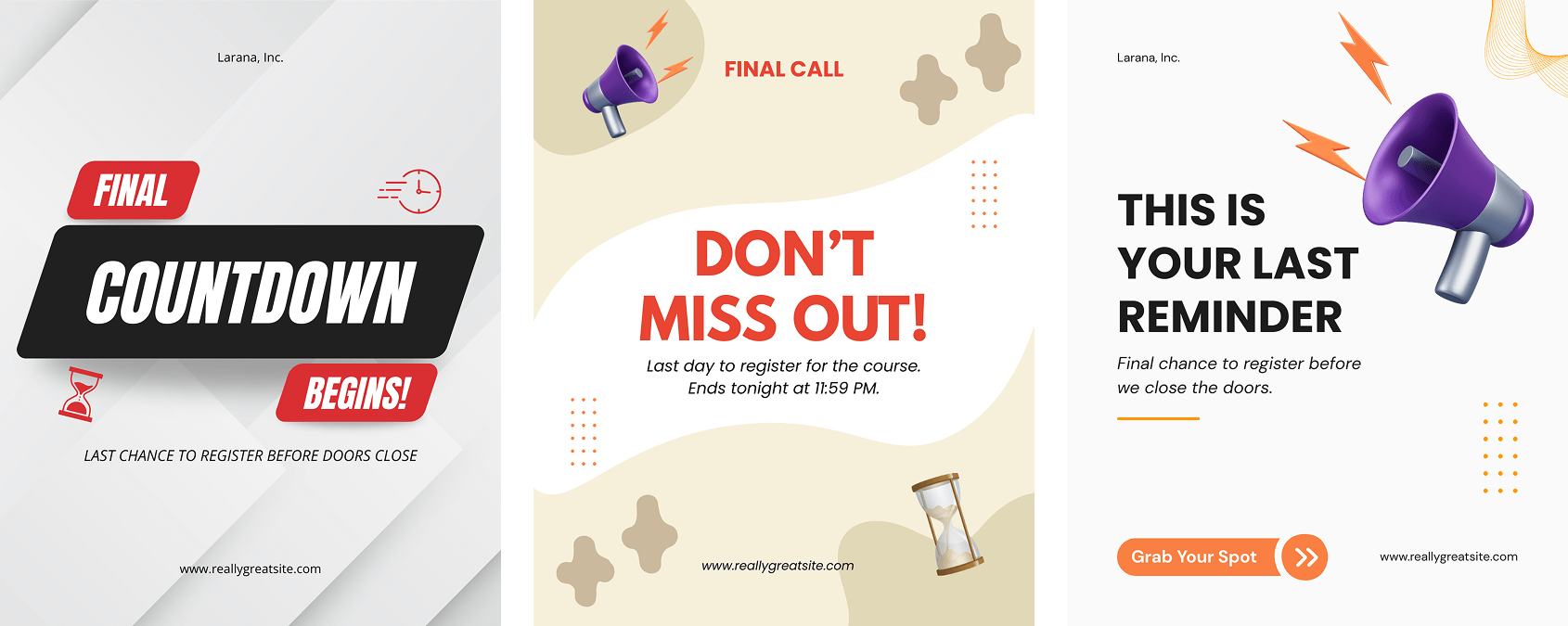
A large portion of buyers regret missing Black Friday or expect a second-chance offer. Meeting that expectation with a short, intentional promotion captures warm leads without rebuilding a full campaign.
How to leverage Teachable:
Read this blog post to learn more about the End of Year narratives.
These simple sales plays require minimal setup but align perfectly with December buyer behavior. They’re designed to help you act quickly, and see results quickly.
Turn one module, template, or resource into a standalone lower-ticket product. This gives hesitant buyers an easier entry point without diluting your flagship offer.
Buyers who purchased earlier in the year are already familiar with your work. A clear “next step” offer often converts well because it meets them mid-journey.
Reintroduce your Black Friday offer for 24–48 hours with a simple two-email sequence. No need to re-explain the offer—buyers already know it.
Pre-sell a January workshop or cohort. This captures December motivation while giving learners a clear starting point for the new year.
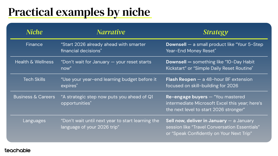
December demand isn’t fading, it’s shifting. When your messaging aligns with how buyers actually behave this month, even small adjustments can turn the final weeks of the year into a high-intent sales window and a strong foundation for January.
Click here to watch the full webinar recording.
Pricing is one of the most powerful levers creators have, not just to increase revenue, but to signal value, improve conversion, and attract the right buyers. In this session, we focused on how to evaluate your current pricing and make strategic updates heading into 2026.
Before getting into strategy, we looked at how the Top 50 creators on Teachable actually price their offers. A few patterns stand out:
Top creators price higher across the board
Top creators build portfolios, not single offers
Format matters more than niche
The takeaway: higher revenue isn’t driven by volume or heavier discounting, it’s driven by intentional pricing, stronger formats, and smarter packaging.
Many creators assume they have a demand problem, when the real issue is price positioning. These signals usually indicate pricing needs an update:
When traffic and engagement are healthy, pricing- not demand - is often the constraint.
Buyers don’t evaluate price based on content volume. They evaluate it based on outcomes and effort saved.
Higher-performing offers tend to emphasize:
This is why shorter, more structured programs often outperform longer, cheaper ones.
Rather than simply raising prices, the session highlighted ways to repackage value more effectively:
The strongest pricing strategies going into 2026 won’t compete on being cheaper. They’ll compete on clarity, fit, and outcomes.
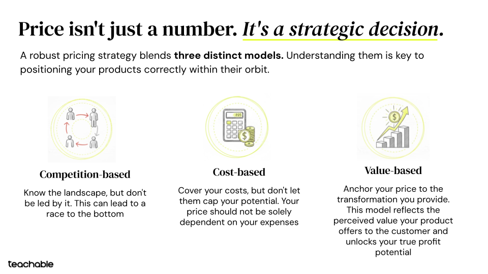
Top creators:
Small pricing adjustments—when paired with the right structure—can unlock meaningful revenue growth without rebuilding your funnel.

So you’ve launched your first course. And it’s converted well. Congrats! What now?
Wait for a few months, then “launch” again? That’s what everyone from Frank Kern to Ramit Sethi does, right?
But those guys have six-figures lists, four-figure courses, and multiple brands. (Sethi has enough courses that he could open one-a-month and never repeat the same course within a year.)
What if there was a way to earn money from your course every day?
It turns out there is: evergreen launch sequences, which give every new subscriber to your list an opportunity to enroll in your course a fixed amount of time after they subscribe, instead of forcing them to wait until you open enrollment manually.
Even if you’re selling an expensive course to a big list, there are reasons you might want to add an evergreen launch sequence – which admits new students to your course on a rolling basis, under its own power once you set it up – to your arsenal.
First, if your course has an optimal sales cycle—the average amount of time it takes a prospective customer to go from not knowing you to ready to buy – an evergreen sequence can catch everybody when they’re most primed to buy, instead of too early or too late.
If your sales cycle is 3 weeks, you can pitch your course to every new subscriber after 3 weeks, whereas if you only do periodic launches, some people will have waited months, whereas others may be too new to your list.
Second, you should probably be making continuous improvements to your course for at least the first year, especially if you’re selling it for more than $100.
Continuously improving your course gives your students a more valuable experience and allows you to raise the price. And an evergreen launch sequence gives you continuous feedback since people are enrolling in your course every day, allowing you to test improvements right away instead of waiting for the next launch cohort.
Finally, you don’t want to wait months to get paid again. An evergreen sequence gives you continual cash flow, so you’re not stuck waiting for the next launch and hoping you earn as much as you predict.

And an evergreen launch sequence doesn’t preclude the opportunity of doing a few launches every year to your whole list. It’s just extra income.
So just put up a sales page and let every new subscriber know you’ve got a course for sale, right?
Not so simple.
I know a lot of ways to get evergreen launches wrong because I personally messed them up. After I launched a successful course, I spent the next year eliminating the “kinks from the hose”. The result: a 4x increase in monthly earnings directly attributable to improvements in conversion rate.
I’m going to show you how to do an evergreen sequence right, by telling you what I got wrong, and what I did to fix it.
When I first launched my course, I didn’t simply put it up for sale and send an announcement email. I spent weeks building expectation, then I opened the doors, but only for five days.
The result was over 50% of my sales on the last day of the launch. So I knew that scarcity, or giving people a limited time or quantity to buy, was a key element in the success of my launch.
But how would I duplicate that experience for new subscribers without doing manual launches?
It turned out the same timer app I was using at the time also allowed evergreen timers, triggered by a potential customer’s first visit to my sales page. That way, everyone would have four days to buy, from the time they first clicked. (Currently, I recommend plugins like Page Expiration Robot, which integrates seamlessly into WordPress, and can also be embedded via HTML on Teachable’s sales pages.)

That left the problem of reminder emails. Recall that more than 50% of my sales came on the last day of my first launch. But you can’t just plug your live launch-week emails into an autoresponder: if a recipient waits until the “last day reminder” to click to the sales page, he’ll still see a timer with four days left, since the first click starts the timer.
Luckily it turns out your email provider has a smarter way: the same click that starts the timer on the sales page can also start a new automation sequence in most email services.
If you’re using a “high end” program like Infusionsoft, you can get fancy, allowing the first click on any of multiple links in multiple emails to trigger the reminder sequence – but even Mailchimp has basic automation features that will allow you reap most of the benefits of reminder sequences.
Just set up a second automation workflow triggered by the first link click to your sales page, and put your reminders there. Bottom line, your customers will receive an email that says “last day”, and they’ll click to the sales page and see less than a day left. Mission accomplished.

Technology solves the problem of making a limited opportunity to buy evergreen, but how do you convey that urgency to your subscribers?
Some marketers are outright dishonest – “I’m launching the course next week for the second time ever” – but I prefer honesty. I just tell people my course is only open occasionally, and that I’ll tell them when I open it. The exact language I use in the emails is along these lines:
“Next week I’m opening the course, to a very select group.” [This is true: people only receive this email if they’ve taken very specific actions in my funnel, and it’s a small subset of my overall subscribers.]
“I’ll open the course for four days. Once I close it, I can’t guarantee the price will be this low again.” [Also completely true. I’ve been raising the price gradually, so while it’s possible someone might get two opportunities to buy at the same price, it’s far-from-guaranteed.]
I don’t want to underplay the significance of raising your price gradually. There are a few reasons this is a great idea:
Oh, and don’t do sales or discounts. They train people to buy only during a “sale”, and erode the perceived value of your course. (If it were really $497, you wouldn’t be charging $27 for it.) Besides, with the scarcity tools I’ve discussed, they’re unnecessary.
My work with End of Jobs author Taylor Pearson launching his Teachable course drove home a lesson I thought I’d already learned: you can have the best copy and best automation tech on earth, and translate into sales if potential customers haven’t felt your teaching work for them.
Here’s why that might not be obvious if you’re taking a one-off launch and making it evergreen. You’ve just launched to a “warm” list (a group with a lot of positive experience with your teaching). Now you’re turning around and trying to sell the same thing to “cold” traffic (people who are interested in what you teach, but who don’t yet know you from Adam). But “warming up” your new subscribers can be the difference between a course that sells like gangbusters and one that hardly sells at all.
My own course helps mediocre drummers become great by showing them the critical few things to focus on so they stop wasting their energy and focus.
By the time a subscriber sees my sales page for the first time, he’s already felt my teaching methods work for him; probably more-than-once, since most of my traffic comes from my free drum videos on YouTube.
Not surprisingly, then, when Taylor and I were testing his course, we found it converted great to the people who had already read the essay the course was based on, and downloaded a weekly planning template to improve their productivity, then were surprised when it didn’t do so well when we turned around and launched it to a “colder” cohort of his list.
“Where did we go wrong?” we asked, scratching our proverbial heads…
OH – that’s right! The first cohort had all downloaded the template. They’d all felt the method work for them: gotten what Taylor called the “dopamine rush”.

This accomplished 3 things:
I now use Taylor’s “dopamine bootcamp” for all my clients, whether they’re launching a course for the first time, or making the launch sequence evergreen.
In its evergreen incarnation, the “dopamine bootcamp” can be an autoresponder. It can even be a lead magnet (an “ethical bribe”) to attract new subscribers to your list. (Your opt-in call-to-action could say “sign up for my Free bootcamp to improve your productivity in just a week”, and require an email address in order to register.)

If I were making the “dopamine week” part of an onboarding sequence (a series of emails a new subscriber receives to acquaint her with your teaching before you hit her up with a sales pitch), I’d send an email like this at the end:
“You’ve felt the system work for you. But you know it’s only scratching the surface. If you’re ready to discover what the complete course can do for you, just click here.”
Finally, I’ve found from selling my own course that including extra “value” emails between and among launch-announcements increased my conversions still more. You can/should experiment with the content and timing of these emails, and it doesn’t hurt if the “value” you’re giving is related to the problem your flagship course solves.
I struggled over which tip to include as my third in this essay. I thought it important to mention that automating more than one launch to new subscribers nearly doubled my earnings.
So do that: for everyone who doesn’t buy at his/her first opportunity, give 3-4 weeks of valuable content, then launch again. After two opportunities, subscribers can be tagged as “seasonal launch”, and you can live-launch to them a few times per year. (You’ll need a second sales page since the timer on the first will have expired.)
But more important is the process I used to arrive at revelations like the above. And Taylor’s launch drove it home: when you’re taking a course and making it evergreen, certain things that worked in the live launch are not going to work anymore.
After Taylor and I converted launched successfully to his “warm” cohorts, we suffered a disappointing result when we tried to roll the course out to a wider audience. Eventually, we identified two primary culprits: the “dopamine” issue I discussed above, and a premature price-rise.
But whatever their cause, you need a quick-and-dirty way to identify the culprits of a low-converting course, and split testing takes time and huge data sets. A reliable-but-underutilized way to discover why people aren’t buying is to ask them.
Taylor and I used three staples that worked wonders for me in selling my own course, and which I now use with all my clients: the “why didn’t you buy” email, the “why did you buy” email, and the “why haven’t you bought yet” email.
In an evergreen sequence, you can automate the former to send a day-or-two after the cart close, to people who haven’t bought. I like to use simple, personal language:
Subject: “Can I ask you something?”
Body: “Hey Nate I noticed you checked out my course but decided not to pull the trigger. Just have to ask, was it me? 😉 In all seriousness, I don’t want anybody to join if it’s not a good fit, but I’m curious – why did you decide not to join this time around?”
Here are the responses you’re looking for:
Here’s the type of response you should dig deeper on:
And here’s the one I always regard with skepticism:
Noticing a theme? It’s easy to get pulled off course by responses from people who would never buy. You’re looking for responses from potential customers whom you didn’t convince, not non-customers.
No less valuable is the “why did you buy” survey. I like to ask variations of the following questions:
I also ask questions related to improving the product, like “If I had to remove 80% of this course and still charge the same amount, what should I take away”, and “if I had to double the price by adding just one more feature, what would it be?” Responses to these questions will help you increase the value you’re delivering, so you can raise your prices.
Finally, a wasted opportunity in an evergreen launch is a “why haven’t you bought yet” email, especially during the first few months. This accomplishes the same thing as the above emails – revealing problems with positioning/copy/proof/logistics/unanswered objections – but allows you to address them in real time, potentially salvaging a sale before it’s too late.
If you’re willing, offer to get on the phone with people, a move that both earns trust and gives you invaluable insight into how your pitch is going over.
You can make your course sales evergreen, but the tech is the easy part. The key going in is to understand that it’s going to be an inherently sloppy process of trial-and-error. You’ll have some weeks or months when you’re not sure it’s working. But keep executing on the strategies:
The payoff will be huge. My current course is silently earning-in-the-background, paying my bills and giving me a chance to focus on deploying what I’ve learned to help other entrepreneurs.

With Black Friday right around the corner, now is the time to determine what discounts to offer to both first-time and repeat students. But if you’re new to your online school or the products you’re offering, you might not know what Black Friday pricing you should offer for the biggest shopping season of the year. Sometimes there’s a fine line between offering excellent deals to your customers and selling products at a loss. Keep in mind, some of the discount strategies below will fit your online business, while others might not. Some discounts work well for coaching or courses. In contrast, others might be better if you’ve got physical products you sell, like merch.
Let’s discuss how you can determine what discounts you should offer for Black Friday to maximize profitability and customer satisfaction.
Percent-based discounts are exactly what they sound like: handy, helpful, and popular discounts that are easy to understand and great for Black Friday sales.
They’re super simple to set up, too; just advertise some of your most profitable products or services at a lower price (by a certain percentage) than they normally are. For example, say that you sell a flagship product for $49.99. With a 20% discount, customers can buy the same product for $39.99.
Percent-based discounts are popular around Black Friday. That’s because customers can immediately see how much they’ll save. You can also make these more noticeable with strikethrough price tags.
However, you need to take a hard look at your numbers and ensure you can withstand the dip in profits. You can analyze the sales vs. profit ratio from previous years using your accounting software and bank account. Most business bank accounts can be integrated with accounting tools, allowing you to identify your income sources easily.
You may find that percent-based discounts are only wise if you can sell a significantly higher volume of products. You would do that by listing them at a higher discount than you would normally.
Here’s an example:

Bundle deals are also popular during holiday sales as they offer more value for money to your customers. They are special Black Friday pricing discounts where you bundle different yet similar or related items together in a single purchase. For instance, maybe you sell coaching and courses. You can bundle these two products by offering a mini course with each coaching purchase made during Black Friday week.
You don’t just have to offer free bundles, either. For example, you might offer two similar products, both at a slight discount, if a customer purchases them both in the same transaction.
Before deciding whether this discount option makes sense for your business, you need to look at your numbers and expected sales. If used unwisely, you could end up giving away a lot of items for free and experiencing a Black Friday shopping season “in the red” instead of “in the black.”
There’s no better time to get people referring their friends and family to your store than around the Black Friday shopping season. You can advertise special sales or discounts for those who refer new customers to your brand to encourage more purchases.
Say that, for example, you run a subscription-based business. You can give everyone who successfully refers a new paying customer to your product one free month of subscription. This is a great way to broaden your customer base. And a way to do it without losing money. After all, each free month of subscription you hand out is paid for by new months of subscriptions from fresh customers.
Before advertising the deal, determine whether your customers will take full advantage of it. You should also be careful with the terms and conditions of the sale. Make sure that new customers stick around for at least one subscription cycle before giving the free deal or discount to the referring customer to keep your finances stable.
Shipping discounts are extremely popular around Black Friday, and for a good reason. If you have a physical product you sell online, you could take advantage of this offer. Many people use Black Friday to shop online, and shipping discounts (or offers for free shipping) are good ways to differentiate yourself from your competitors.
However, offering free or discounted shipping means you have to foot the bill for all those transportation costs. Make sure that the expected profits from selling more units or subscriptions will compensate for those extra operating expenses. Otherwise, you’ll run your business at a loss during this critical time.
One great way to ensure this discount works for your brand is to only offer shipping discounts or free shipping for customers who spend a certain amount of money.
Is your business model based on a subscription or software service? Then free trials and demos are perfect for your holiday offers. Free trials and demos are more likely to be checked out during Black Friday and Cyber Monday, as people are looking for Christmas gifts.
Just make sure the free trials and demo offers aren’t too generous. For example, a free trial for one month could result in people perpetually making new accounts to use your software platform without ever paying you a cent.
Have a VIP or loyalty program? Consider offering special discounts or sales to those loyalty program members. These can be fairly generous and incentivizing. You want to keep these core consumers happy and satisfied during this important shopping season.
VIP discounts can include free shipping (exclusively for loyalty members, of course), major percentage-based discounts, or special bundles. Be smart about what your loyalty program members want when crafting these accounts or sales.
Lastly, take advantage of digital marketing to send personalized Black Friday discounts and offers to previous customers via email. Personalized offers, such as product recommendations or discounts on favorite, repeat purchases, can do a lot for building relationships with customers. Of course, make sure these personalized offers aren’t too generous and that they incentivize further shopping.
A perfect example of a personalized offer is free shipping if the recurring customer spends at least $30 on their favorite items. In many cases, your regular customers will tell themselves that they were already planning to shop at your store. So they might as well do it now when they can take advantage of the special offer!
As you can see, there are lots of different discounts and special deals you can offer your customers or students to make you Black Friday pricing appealing. Some of the discounts above might be more applicable to your coaching and courses. While others might work better if you have physical products you sell too. But consider each of the above discounts and deal examples carefully alongside your bottom line, operating expenses, and other factors. To maximize success, analyze your finances carefully so you can offer stellar deals that don’t break the bank.
Black Friday pushes a lot of creators into panic mode. You feel the clock ticking. You want your course ready. You want everything polished. You want the launch to land. That pressure builds until the work feels heavier than the opportunity.
You deserve a plan that protects your energy and your earnings. You also deserve a plan that helps you grow your audience, build trust, and bring in revenue before the busiest sales week of the year hits.
Monique Lu, Creator Programs Specialist at Teachable and Jordan Hoopingarner, Customer Success Manager at Teachable hosted a Black Friday webinar mapping out precisely how you can sell more this Black Friday, even if you haven’t built your product yet.
You already carry enough responsibility as a creator. Recording lessons alone in your office for weeks on end drains your spark. You publish nothing while perfection eats your time. You quietly keep building and hope the finished product lands with a splash.
You end up tired. You end up unsure. You end up launching without any signal that your audience wants what you spent all that time making.
You deserve a calmer, cleaner way forward.

Pre-selling removes the pressure that comes from creating in isolation. You stop guessing. You stop grinding alone. You create with your audience instead of creating for them. That shift reshapes the entire process.
You get answers faster when you ask your audience directly. Validation comes from polls, comments, tiny tests, or short conversations. Your audience tells you exactly where the demand sits. You can shape your direction based on real responses instead of internal assumptions.
You get clarity the moment the first payment hits. Revenue carries more weight than engagement. Early income proves your idea resonates. That confirmation sets your pace and keeps your energy steady.
You get stronger material when your earliest buyers help shape the details. Students surface real questions. Students share the specific obstacles they face. Students guide you toward examples and explanations that hit the mark.
This three-part shift gives you momentum while removing the heavy load that usually sits on your shoulders.
You give your audience early access at a fair price. You outline the course, set a delivery window, and share exactly what they can expect. You build the course after confirming the demand. You never pretend something exists when it doesn’t. You simply lead with clarity and confidence.
This approach gives you revenue, validation, collaboration, and excitement before creation begins.

You can follow the same path Jen took when she built her first course. She launched with a simple sales page, clear messaging, and no recorded lessons. Her audience understood the promise and trusted the delivery. Jen earned more than $25,000 in two weeks using nothing more than clarity, timing, and transparency.

You can use Jack’s strategy when you want quick momentum without heavy production. Jack offered bonuses that already existed and layered them onto an early-access promotion. His audience saw immediate value and moved quickly. His results showed how much lift comes from urgency and relevance.
These creators moved fast because they trusted their audience enough to launch early.

You can start earning long before Black Friday by following the same three steps Monique and Jordan walked through during the session.
You already carry enough knowledge to pre-sell something meaningful. You can package a workshop, mini course, curriculum draft, coaching hybrid, or membership starter. The key sits in defining the outcome. A clear promise carries the offer.
You can launch a polished page without complex design work. You add your core details, list your draft outline, choose a price, and publish. Teachable handles the layout so you can focus on the message.
You can talk openly about what you’re building. Email your list. Post on your socials. Invite your warmest followers. Share behind-the-scenes snapshots of your process. Your audience loves being included. Your pre-sell grows stronger each time you show up.
Black Friday buyers move quickly. You give yourself an advantage when your offer speaks clearly and delivers value they can feel immediately.
What shapes an irresistible offer?

You present a simple, strong value exchange that helps buyers feel certain about their decision. A direct promise, a clear outcome, and a meaningful reason to purchase create momentum. Your buyer moves with conviction because the value feels obvious.
Elements that strengthen your Black Friday offer:
These pieces appeared throughout the webinar because they consistently drive action.

You can communicate your offer more effectively with a simple storytelling flow. Monique shared a structure that sharpens your message and helps buyers understand why this offer fits their needs.
Hook: You pull them into the moment with one clear line.
Pain: You describe the challenge they recognize in their own life.
Solution: You show them how your offer helps them move forward.
Call to action: You guide them with the next step.
This format works on sales pages, social posts, emails, live streams, and short videos.
You can use this strategy to generate fast action and keep your Black Friday sale running smoothly from start to finish. Jordan mapped out a clean, repeatable sequence that works across every niche.
You create a strong pre-sell. You generate a limited batch of high-discount coupons. You turn on the setting that displays how many remain. You share the countdown. You schedule the release. You let the coupons sell out. You roll into your standard Black Friday offer once the supply hits zero. You close with a strong final push.
This method rewards early buyers and builds healthy demand from the very beginning of your sale.
You can widen your reach by promoting your offer across the channels your audience already uses. The webinar included a straightforward checklist that covers every major traffic source.
Channels to use:

Each channel plays a different role. Social posts build awareness. Email drives conversions. Affiliates introduce you to new buyers. Paid ads help when you have existing audience data.
You can strengthen your sales performance with the tools already built inside your Teachable account.
These features give creators more leverage during the biggest sales window of the year.

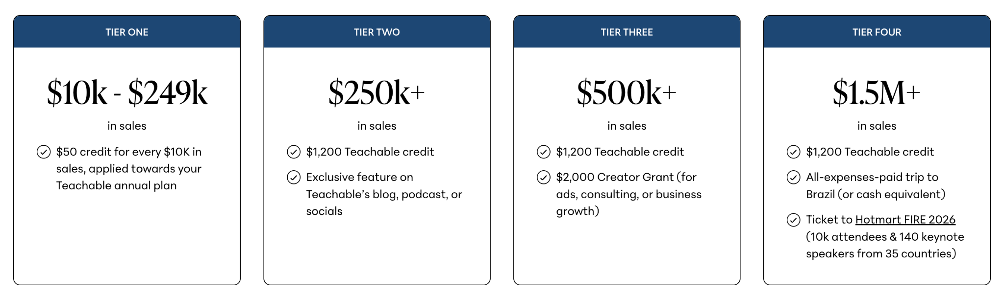
You can join the Black Friday Sales Challenge for extra rewards as you make sales through the end of the year. You can earn subscription credits, Creator Grants, and even a fully covered trip to Brazil for a major creator economy event. You can accelerate your progress when you use BackOffice which gives you a 1.2x multiplier on all challenge earnings.
Join the Teachable Black Friday Sales Challenge today


You know that your course deserves a lot of time and energy. But, there’s another feature of your online business that deserves just as much consideration—your course sales page. Your sales page is your best asset for proving your course’s value and cluing your audience in to the transformation they can expect to experience as your student. We’re breaking down exactly why a powerful sales page matters.
When presented with two similar products consumers will always search for clues that one is more closely aligned to their needs and values than the other. You could have the absolute best resource for your niche, but if you’re not making that clear on your sales page, it’ll be hard to convince people to buy.
To create a powerful sales page for your course, think about two things:
Persuasive, authoritative copy builds trust with your audience and gives them points to relate to you on. But good copy alone won’t make a sale. You also have to make sure you structure your powerful sales page in a logical way that makes it seamless and easy for people to purchase.
If sales copy intimidates you, you’re not alone. Even skilled bloggers and content marketers make the mistake of writing sales copy as they would any other copy. But, your sales copy must be distinct because unlike a blog post, the end goal on a sales page is a purchase.
Great sales copy conveys at least two things: the value of your product and the urgency to enroll now.
You can think of writing sales copy as a step-by-step process. When executed correctly, sales copy can result in increased sales and more income for you. Here’s how to get started:
Your course isn’t a perfect one-size-fits-all solution for everyone. You shouldn’t advertise it as such. Before you write a line of copy, figure out exactly who your target audience is. Consider these factors:
As you answer these questions, a persona will start to emerge. The more specific you can get, the better (imagine one person, maybe someone you know).
If you know that your target persona is a 55-year-old male who is a first-time entrepreneur honing his business idea, it’s much easier to develop copy that’s persuasive. You’ll be able to talk about technology and business in a way that makes the most sense to him, which will make it a no-brainer for him to take your course. After all, you understand him, and he can trust you.
Take a look at how Melyssa Griffin clearly describes who her online course is best fit for and who isn’t right for taking Pinfinite Growth.
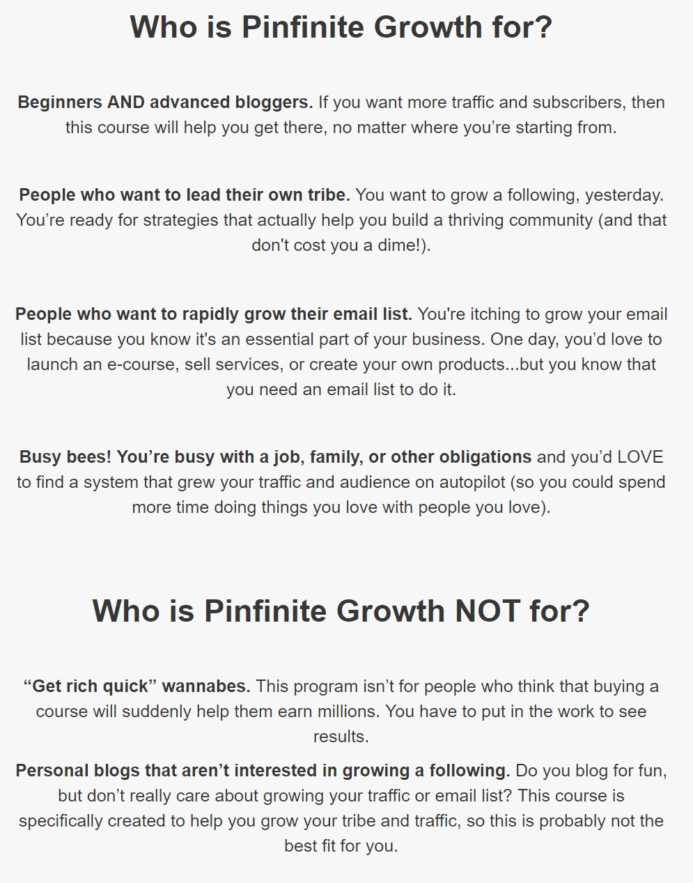
Off the bat she says that this course is perfect for bloggers new and old. She states strategies in her online course will help anyone looking to grow their traffic and email list. Furthermore, the course is perfect for busy folk who are looking to run their Pinterest on autopilot without having to devote a ton of time or energy to the program.
By making it clear who you’re targeting with your course you accomplish two things:
A powerful sales page should be easily scannable and digestible. Your audience is likely to first scan a sales page before diving in. Divide your sales page into very clear sections set apart by images, graphs, and color blocking. You can also use plenty of bold text and colorful text to make certain points and statements stand out.
Your audience members should be able to take a very quick, 15-second look at your sales page as a whole and already have an idea of whether or not your course is going to be a fit for them. Based on an initial scan, your audience will decide whether they should stick around.
This one step will encourage significantly more people to stick around and take the time to read your page, giving you more opportunity to win your audience over via your superior sales copy.
At Teachable, we make dividing up your sales page simple. Our default template breaks up the sections for you. And, our text editor makes adding heading and different sized text simple.

As an entrepreneur your story matters. And, telling a story on your sales page can really help your audience connect with you and your product. By painting a vivid picture of who can benefit from your product and the problems you’re going to solve, you can help people connect with your product. Start by telling your own story or sharing a case study featuring a friend or client you helped. This increases your authority and adds to a powerful sales page.
Describing a clear pain point that your online course is going to solve. Then explain how your course will help your students overcome that pain point. Doing so is very valuable in creating a powerful sales page.
People naturally try to talk themselves out of making big purchase—whether it’s a new vacuum cleaner or an online course that can transform their life or business.
You need to nip that tendency in the bud.
Address any rational concerns someone might have when it comes to buying your course. Frame your online course as the best possible solution for the problems that your audience is having.
A call to action is exactly what it sounds like: text or an image that’s calling out to your reader to take an action. And, it can be as simple as “Enroll now!” or a little punchier, “Join the fun and buy today!”
It’s easy to worry about being salesy and opt for softer calls to action, like “Learn More.” But if your copy is doing its job, your future students are looking for a clear button that tells them exactly where to purchase. So, be upfront and ask people to purchase or sign up for your course, because that’s why you brought them to your sales page in the first place (and that’s why they’re there).
Benefit-driven language presents your course to your audience in a way that appeals to them and their needs. Instead of saying, “I’m giving you five hours worth of content that I spent two months creating!” You can say “After taking this course you’ll be able X which will result in Y and Z.”
Make sure that your sales copy is less about you and more about your audience and your online course. Here is an example of benefit driven language from Reach Your Readers by Creativindie.

Benefit-driven language helps people visualize what the outcome of the course will be, and they’re going to be more excited to buy.
Here are five great online voices to subscribe to for tips:
Now, let’s take a look at the actual structure to use for your sales page.
When it comes to the design of a powerful sales page, there is a simple formula you can follow for maximum results.
Luckily, Teachable’s sales page editor makes following this formula to create a beautiful sales page that converts easy and intuitive.
The headline is your first place to really wow your potential customers and get them intrigued. In this example from “Creating a Profitable Podcast” you can see they use:
They give their most eager students a chance to enroll right on top of the page. Your Teachable school comes with a hero CTA right out of the box.
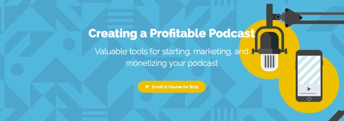
Now, you don’t have to use bright colors if they aren’t part of your brand. But, do consider color theory and how your colors are playing together. Make sure that your text isn’t hard to reach or blending into the background. The color wheel from Canva is a great resource.
As for using descriptive language, think of words like: ‘profitable’, ‘valuable’, and ‘monetizing’. These are powerful words because they are very clear and get at one of the primary things that drives people’s behavior—money. It’s more valuable to teach someone how to do something and be successful with it than just teach them how to do something.
Now that you have your audience’s attention, hook them in with a powerful course description. Create a description that will appeal to your ideal audience and get them excited about the prospect of taking your online course.
One thing to make sure you’re establishing when creating a powerful sales page: your transformation. What exactly will your audience get from taking your online course? Make it very clear what you’re setting out to teach.
Here’s a great example of a course description from Contino Workshop.
“Join me, alphastructaesthetitologist* Jon Contino, as I walk you through every step it takes to become a master lettering artist! From the history of written language all the way to customizing letters for logo design, this class will provide you with the tools it takes to make, break and rebuild letterforms into strong, interesting and unique works of art.
In this super-efficient crash course, I will share vital and core knowledge of typography history, the tools it takes to design letters, explain in detail how to master fundamental lettering and, of course, how to create your own style.
With 37 lecture and demonstration videos, a PDF workbook, and a detailed list of resources and where to get them, this class will benefit everyone from the first-time lettering artist to the seasoned pro!“
A case study is a narrative account of someone’s experience after they’ve gone through your curriculum and benefited from it. For example, if you’re teaching how to negotiate for a raise in your corporate job, take a look at someone who took your course and successfully negotiated her biggest raise to date.
A testimonial is someone singing your or your course’s praise. Your call to action is simply the place where you’re going to urge your audience to take the plunge and purchase your online course. It could appear as a button or a hyperlink depending on the design of your site.
Introduce yourself! People are going to be curious about who you are and what your credentials may be.
Depending on the nature of your online course, you might want to include the following:
Here’s a great instructor bio from Coding Explained:

If people are still on the edge of deciding whether or not to purchase, giving them a sneak peek of your curriculum can help them get excited. Here’s an example of how that might look from Pitch Perfect by Elana Gross.
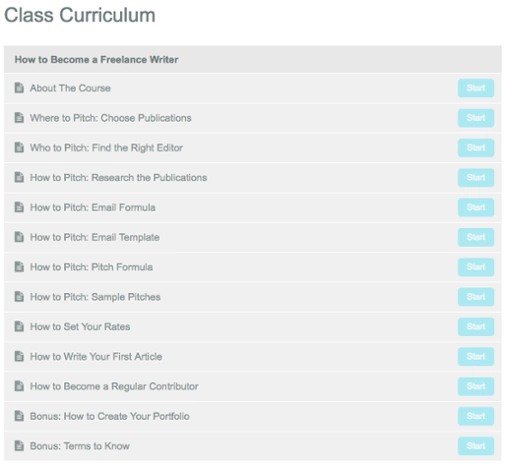
Again, highlight how incredible your course is by sharing someone else’s experiences with it. Interspersing your sales page with endorsement from others is a subtle way to make major progress on convincing someone to buy your course.
The more thorough your FAQ section is, the less time you’ll spend answering the same question over and over again via email. Your FAQ can calm your audience’s fears over things like refund policies. And, it also help them understand the nature of your online course a little bit better.
Here is a great example of an FAQ Section from Content Strategist Certification Course.
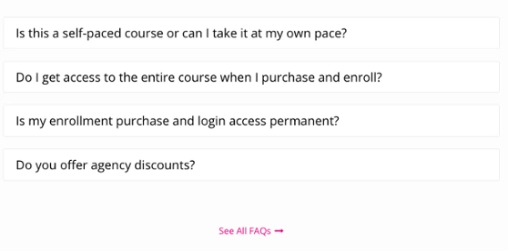
Here’s your final CTA. Hopefully by now your audience has made up their mind to purchase. And your last CTA is going to make it easy. Having multiple opportunities to buy on your page helps prevents your future customers from hunting for your “buy” button.
When you’re designing your sales page, it’s easy to go overboard. But a few key design tips can prevent that:

Oftentimes, a landing page sets the first impression a potential customer has of your business. The best landing pages inspire visitors to take action. It tells your brand's story, nurtures new customers, and drives conversions – landing pages have 160% higher conversion rates compared to other types of sign-up forms.
To maximize your chances of getting new leads and increasing your sales, you want to make sure you invest your time and effort in building a landing page with great design for your business. Improving your landing page design can lower your paid ad spend because each new visitor who lands on your improved page through ads will be more willing to stick around and convert into a new lead.
Sounds pretty good, right? Now that you know the benefits of a well-designed landing page, let's talk about how to create high-converting landing pages for your business.
A landing page definition is pretty straightforward — it's a single page with a specific target of getting visitors to complete an action. The name "landing page" comes from the idea that people will land on it from somewhere else, usually digital marketing, such as an ad campaign.
Your landing page design needs to speak to your target audience and drive them to your call-to-action (CTA). A CTA can be for a visitor to sign up for your newsletter, download an ebook, enroll in your online course, buy a product, or something else. Everything on a landing page, from copy and images to layout, should support that one goal.
There are different types of landing pages, and each has a slightly different purpose:
{{salespage-component="/blog-shortcodes/blog-popup"}}
Effective landing page design consists of a few key components. These six components need to work in cohesion together to create a high-converting landing page. The key landing page elements are:
Your headline is the first thing a viewer will see when they come to your page. It needs to be clear and concise, confirm your offer, and include messaging that reflects the audience's entrance point.
For example, Function of Beauty has a landing page for its line of custom skincare products. The headline is "the world's most customized skin care". It highlights that it is made for you, not just a skin type and it also uses a personalized quiz CTA to reinforce the custom skincare value proposition.
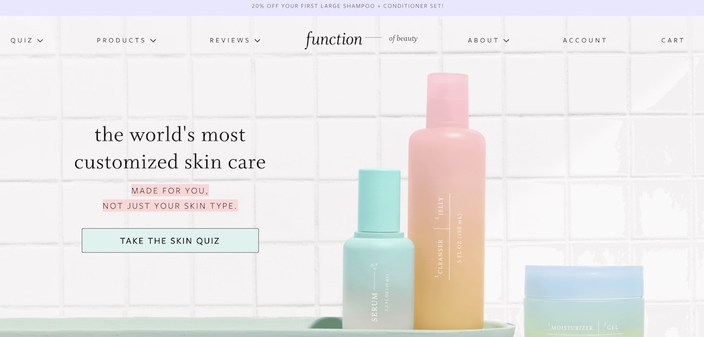
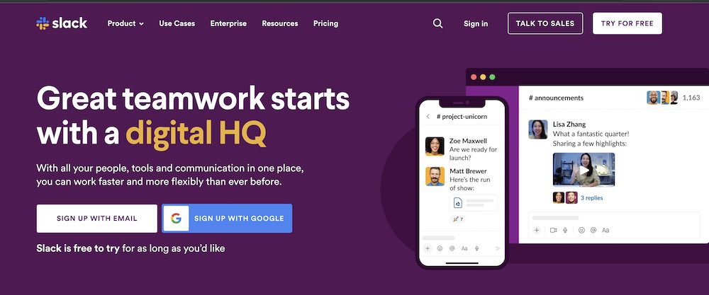
Your subhead is a more in-depth description of your headline. It usually appears just below your headline, and it is in a smaller font. Use the subhead to be persuasive and explain your offer in greater detail.
Let's look at Slack as an example. It clearly highlights the value proposition — work faster and more flexibly — when you use Slack.
Include a striking image of your product or a photograph that relates to your message. It is even better if you can show your product or service in action or include a video — that alone can increase conversion rates by 86%.
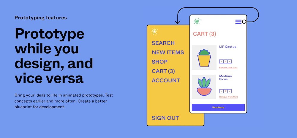
According to The Next Web, our brains process visuals 60,000 times faster than text. Captivating images makes your page look better and gives your audience a better page experience. They also provide visual cues to entice your audience to remain on your page and learn more about your offer.
As a design tool, Figma needs to have well-designed visuals. This landing page for its prototype features includes examples of what you can create using Figma. It makes it easy to visualize using it for your design projects.
Your landing page should be easy to navigate no matter what device people use to access it, and have all the important information in a very digestable form. Minimize the pop-ups, because too made might cause people to click off your page, and ensure your landing page loads quickly, because there is a 4.42% drop in conversion rates for every second of load-time.
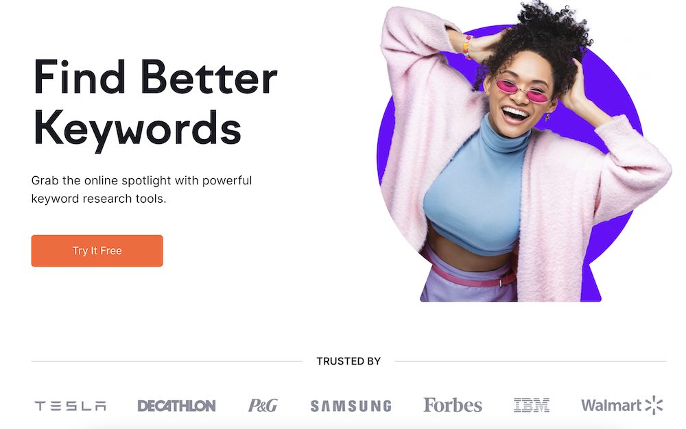
Including social proof no your landing pages can increase the conversion rates by 5%. Social proof shows your audience that others have taken your course or used your products and would recommend it. It is a necessity to design landing pages that convert. The more a visitor sees that others like and benefit from using your product, the more likely they are to convert.
You can leverage different types of social proof, including testimonials, reviews, and press features.
Usually, social proof will appear many times on a landing page, primarily right after the above-the-fold section. Semrush is a great social proof example. You can see they include top companies that use the product, leveraging their brand equity and creating credibility.
Your call-to-action is the most important element of your landing page – that's why you have a landing page. You want someone to sign up for your offer. What it looks like, how it reads, and where it is placed will impact your conversion rate.
Remember, you want to have just one CTA – multiple CTA's reduce the conversion by 226%. A single strong CTA makes it clear to potential customers what you want them to do. Plus, you'll increase your chance of conversion if you are driving them to one goal versus dividing their attention between more than one.
Be brief but clear. Avoid the "submit" and "send" CTA buttons because they are vague. You need to describe exactly what you want from your customers or the next steps — what will happen when they click.
Another element you can capture in your CTA is urgency. For example, this landing page for Nom Nom highlights a special offer to get 50% off and free shipping.

Let's talk about landing page best practices that will help you design great landing pages that convert well and bring in new leads to your business.
When it comes to design, sometimes less is definitely more. Utilizing the white space when creating your landing page can be a simple yet powerful way to increase your conversions. By definition, the white space is the space in between design elements, and it doesn't have to be white – it can be any solid color.
So, why white space is important? Well, it makes your landing page easier to read, which means that people will digest information much easier. Also, white space is prominent in modern designs, and it signals to your website visitors that you're a modern, innovative brand.
When designing your landing page, make sure you take the less is more approach and let the design elements you choose to use stand out on their own.
Load speed is the single most important aspect of a successful landing page. It has to load fast and efficiently so visitors can turn into warm leads. So, be wary of adding images and videos to your landing page, and make sure you're optimizing them to increase your lead speed.
Over 60% of all website traffic comes from mobile devices. It's crucial that when you're building your landing page, you optimize not only for desktop but also for mobile. You might even do better if you design your landing page through the mobile view (which most landing page builders like Unbounce and Leadpages should support). It's also smart to do a quick test once you're done with the design to make sure all the elements of your landing page work on mobile, too.
Once you have nailed the design of your landing page, it's time to put it to the test. That's where A/B testing or split testing comes in handy. Split testing involves splitting the traffic into two (or more) groups and directing them to different versions of the same landing page to see which one performs better. It's an essential component of conversion optimization.
The key to successful A/B testing is to focus on tweaking small details. Instead of creating two different landing page designs, create identical ones and test one element at a time (headline, visuals, etc.) to see what works the best and what might be your pain points.
So, what are the elements you want to test with split testing? We recommend starting with:
These elements can have a huge impact on your conversions, and even the smallest change can make a difference.
A headline and strong call-to-action can make or break your landing page – that's how important these two elements are. So, spend the time crafting the perfect headline and CTA for your landing page. Better yet – draft a few different options and conduct an A/B testing (as we discussed before).
Effective headlines have these three things:
If you keep these three elements in mind when drafting your landing page headlines, chances are that you'll be able to craft just the right headline (or a few) that speak to your target audience and increase your conversions.
When creating a CTA, it's best to enclose the CTA text in a box. This makes it look like a button, and people want to click buttons. When the mouse hovers over the button, have it change colors or shade. It entices people to click and shows them that it is clickable.
The button color doesn't matter that much, but contrast does. Your CTA button should stand out from everything else on the page. First, find the main color of your site, then look at the color that is directly opposite it on the color wheel. That is the best complementary color for you to use for your CTA. For example, if your page background is blue, use an orange CTA to stand out from the rest of the site.
Lastly, size is important. Make the button larger than the other text on the page. You don't want your ultimate goal to get lost. Include white space around your button, so it clearly stands out from everything else on the page.
Sun Basket has a CTA button that pops off the page. The bright yellow stands out from the background, and there is enough white space around it to draw your attention.
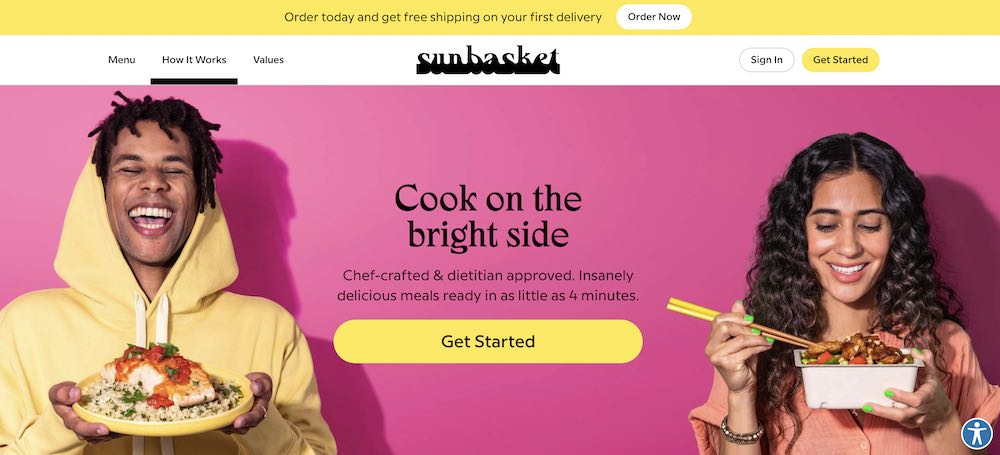
Landing page visuals such as images and videos can elevate the design to the next level and improve your landing page conversions. Visuals help break down the text and make the landing page much easier to read. Also, visuals make the landing page much more engaging, which can be a great way to hook the visitors in and keep them on the page longer.
While not every landing page requires a video, using images on landing pages is a must. Always make sure that the images make sense and complement your copy, offer, brand, or tell a story that helps entice visitors to take the action you want them to take.
Including images like infographics can be a very engaging, and you might want to consider turning your social proof like testimonials and reviews into images instead of having them in the text form.
The best way to understand the secret to building successful landing pages is to see all these practical tips we discussed today brought to life. So, let's take a look at a few powerful landing page examples:

This is an excellent example of a click-through landing page.
A strong headline, a quick subhead explaining the most important thing, and a very clear CTA to type your email address and get a free trial of the software.
Lower down the page, it has social proof and an FAQ section addressing the most important questions and concerns people might have, which all add to a very simple yet effective landing page design.

Ali Abdaal's landing page for his bestselling book Feel Good Productivity takes the landing page design to the next level. The landing page design is simple, yet effective and super interacting with all the visual element playfully moving through the screen as you scroll down, without impacting the load speed or responsiveness.
This landing page has a strong headline, video explainer, testimonials from industry experts, and very clear CTA's inviting you to buy the book at the very top and bottom of the landing page.
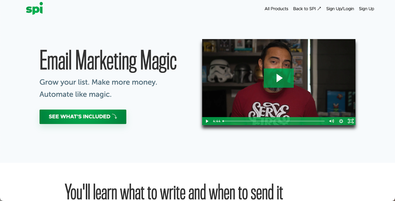
Pat Flynn's online course landing page is very modern and simple, and it captures the visitor's attention immediately. The headline and subhead tell you everything you need to know about the course, and the video explainer is engaging and enticing. There is a very clear CTA, testimonials, and even an FAQ addressing any questions people might have about joining his online course.

It's worth putting in the effort in your landing pages for free training, and Jenna Kutcher is a great example. Her free email-building training landing page is informative and engaging and has the best personalized CTA right at the beginning of the page. While there is no explainer video, there are visual assets like videos and images of Jenna, which make the design high-quality and professional.

Another phenomenal free-training landing page example is for Mel Robbins's 2-part video training. Right at the very top of the landing page, you see the benefits you'll gain from taking part in this training. Next to it, there is a video explainer, that's informative and engaging. The CTA is clear and simple and takes less than a few seconds of people's time.
Once your landing page is live, your landing page analytics will be your best friend. Through analytics, you can learn what works and what doesn't, and you can get a better look at your audience's behavior. By analyzing your analytics, you'll be able to improve and reap better results for your business.
Here are some of the most important metrics you want to pay attention to when it comes to analytics and optimizing landing pages:
The two most common landing page challenges businesses face are high bounce rates and low conversion rates. If you're also facing these challenges, don't be alarmed – we have landing page solutions for every challenge you might face.
On average, landing pages have a bounce rate of between 70-90%. Obviously, you want to keep your bounce rate at the lower side of things because if you have a high bounce rate, it means that something on your landing page is not working for people. It could be a marketing problem – you're attracting the wrong people, so they bounce quickly. Or, it could be an indication that you need to improve your landing page design.
So, consider tackling the issue at hand in small steps. First, review your marketing efforts and see if your social media promos, and paid advertisement is driving the right people to your landing page. If you find that you are targeting the right people, then it's time to take a look at your landing page design.
Consider tweaking small elements like headlines and your visuals (include visuals if you have none), and review your CTA's – are they clear? Is there more than one? Make sure your copy is easy to read and digest. Utilize the white space and simplify your landing page design.
The average landing page conversion rate across all industries is 4.3%. A good conversion rate is anything above 10%. If you notice your conversion rate to be low, don't get discouraged – there are plenty of things you can do to change that.
One thing that could compromise your conversion rates is your CTA. So, the first thing you want to do is review your CTA's – is there one clear CTA or multiple ones? Is the CTA personalized or general? Does your CTA stand out, or does it get lost amongst other design elements on your landing page?
Once you review your CTAs and make adjustments where needed, you should see an increase in your conversion rates. If not, then consider looking into your submission form, especially if you notice high form abandonment rate. Remember, the more information you ask in the sign up form, the less likely people are to sign up. Maybe it's worth simplifying your submission form to minimize the obstacle.
Alternatively, you might need to reconsider your offer. Maybe it's not clear enough, or maybe you need to find a different angle to convince people why they should sign up for your offer, and how much value they'll get from it if they do sign up.
Ready to boost your business with high-converting landing pages? With Teachable, you can easily create pages for your learning products. Sign up for a free Teachable account today and get access to powerful tools and resources to help you design pages that drive sales and capture leads. Start now!

Oftentimes, a landing page sets the first impression a potential customer has of your business. The best landing pages inspire visitors to take action. It tells your brand's story, nurtures new customers, and drives conversions – landing pages have 160% higher conversion rates compared to other types of sign-up forms.
To maximize your chances of getting new leads and increasing your sales, you want to make sure you invest your time and effort in building a landing page with great design for your business. Improving your landing page design can lower your paid ad spend because each new visitor who lands on your improved page through ads will be more willing to stick around and convert into a new lead.
Sounds pretty good, right? Now that you know the benefits of a well-designed landing page, let's talk about how to create high-converting landing pages for your business.
{{salespage-component="/blog-shortcodes/blog-popup"}}
A landing page definition is pretty straightforward — it's a single page with a specific target of getting visitors to complete an action. The name "landing page" comes from the idea that people will land on it from somewhere else, usually digital marketing, such as an ad campaign.
Your landing page design needs to speak to your target audience and drive them to your call-to-action (CTA). A CTA can be for a visitor to sign up for your newsletter, download an ebook, enroll in your online course, buy a product, or something else. Everything on a landing page, from copy and images to layout, should support that one goal.
There are different types of landing pages, and each has a slightly different purpose:
Note: At Teachable, you may sometimes hear us call a landing page a “sales page”.
A landing page is different from a homepage. A homepage is designed to appeal to multiple audiences and convey information to anyone interested in your overall brand.
For example, Monday.com is a popular work management tool. If you look at its homepage, it speaks to all of its audiences and products from project management to CRM.
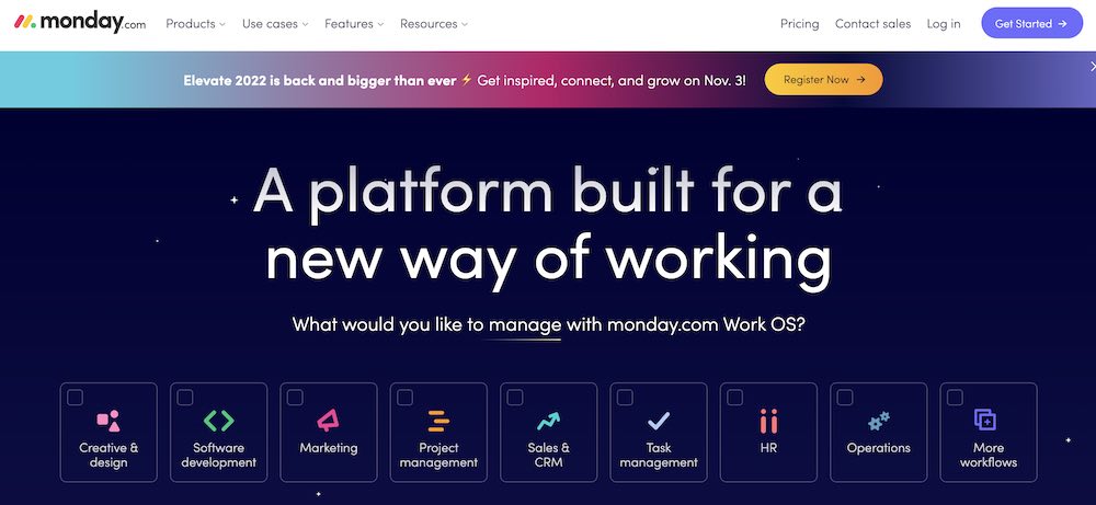
However, it also has Google Ads running for its different verticals. If you search for a project management tool in Google, you might see a Monday.com ad. It takes you to a project management-specific landing page.
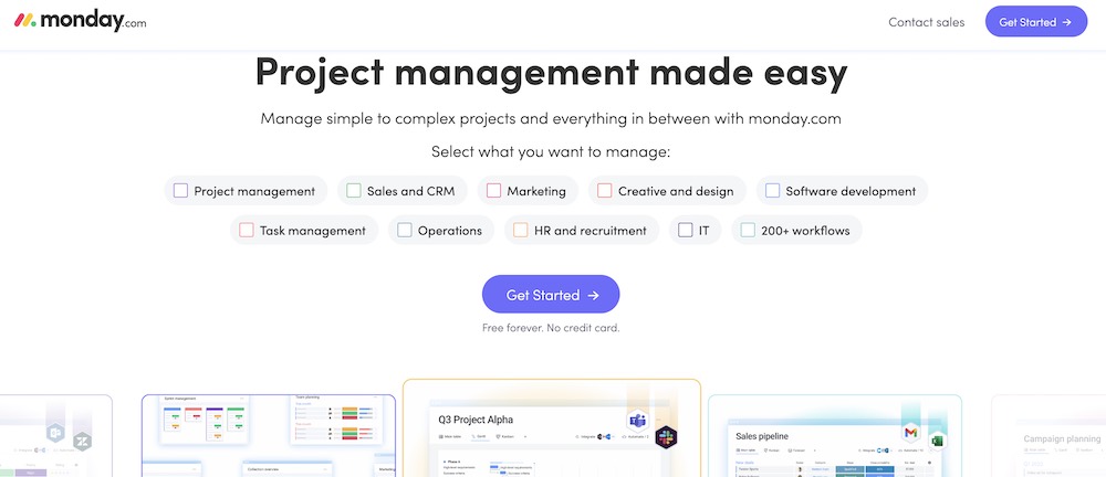
Similarly, if you were to search for CRMs, you might see a CRM landing page. With this, you can easily visualize how a homepage differs from a landing page.
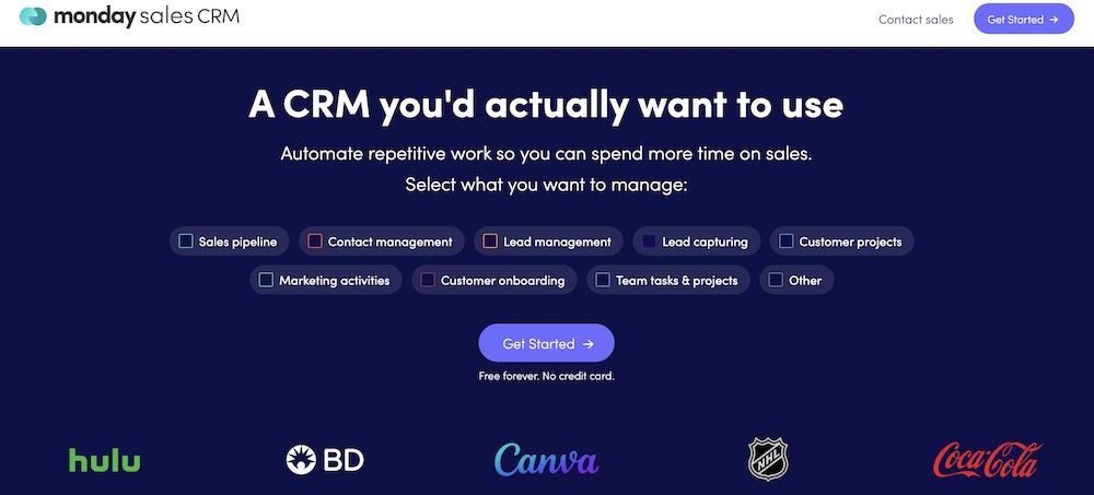
To create a landing page, you first need to craft your copy. These tips can help you write a landing page that communicates your brand story, what your product or service does, and why visitors should take action.
These four questions explain what potential customers get from you and why they can’t live without your offer, while also creating a sense of urgency.
When you are first writing a landing page, answering these questions can help you form your outline.
Simply put, these questions are the beginning steps to building your page’s unique selling proposition. Also known as the value proposition, it is a statement that clearly identifies why a customer buys your product or service.
When you build landing page, consider your audience and your competition. Your landing page copy needs to be tailored to your audience.
Knowing their hopes, ambitions, and goals will make writing engaging copy much easier.
Try visiting online communities, forums, or websites where your audience hangs out. You’ll discover their desires, problems, and what they enjoy. You can use this information to help tailor your copy to their preferences.
In addition, do competitor research. Make a list of at least three competitors and audit their landing pages. How do they position themselves? Where do you beat your competitors?
The goal of your landing page is to get your audience to convert. The copy of your page needs to be centered around this goal and reinforced each time you write a headline, a subhead, and a call-to-action.
Each of these sections communicates your unique value proposition: why people will buy from you and not your competition.
Your text needs to be captivating, persuasive, and above all else, clear. You don’t want your audience to be confused about what you are telling them or what they are getting from being on your page.
One way to do this is by using “power words”. These specific words evoke emotion and establish a connection with visitors, which can help increase conversions.
There are many power words that you can use, but these are three of the most common.
Use these three words to connect with your audience and entice them to buy your product.
If you are unsure of what other power words to use, get some inspiration from your existing customers. Is there a word or phrase they keep using in emails, on social media, or on online forums when talking about your product? If so, try out that phrase.
Talk to a friend, peer, or audience member to see if the message you’re envisioning translates correctly to them. You can even A/B test to see if one performs better than the other.
Now that you have a rough draft of your landing page copy, you’ll need to organize it into sections or components. There are six main components that are crucial to landing page optimization.
These six components need to work in cohesion together to create a high-converting landing page.
Your headline is the first thing a viewer will see when they come to your page. It needs to be clear and concise, confirm your offer, and include messaging that reflects the audience's entrance point.
Effective headlines have these three things:
If you keep these three elements in mind when drafting your landing page headlines, chances are that you'll be able to craft just the right headline (or a few) that speak to your target audience and increase your conversions.
For example, Function of Beauty has a landing page for its line of custom skincare products. The headline is "the world's most customized skin care". It highlights that it is made for you, not just a skin type and it also uses a personalized quiz CTA to reinforce the custom skincare value proposition.
Your subhead is a more in-depth description of your headline. It usually appears just below your headline, and it is in a smaller font. Use the subhead to be persuasive and explain your offer in greater detail.
Let's look at Slack as an example. It clearly highlights the value proposition — work faster and more flexibly — when you use Slack.
Include a striking image of your product or a photograph that relates to your message. It is even better if you can show your product or service in action or include a video — that alone can increase conversion rates by 86%.
According to The Next Web, our brains process visuals 60,000 times faster than text. Captivating images makes your page look better and gives your audience a better page experience. They also provide visual cues to entice your audience to remain on your page and learn more about your offer.
As a design tool, Figma needs to have well-designed visuals. This landing page for its prototype features includes examples of what you can create using Figma. It makes it easy to visualize using it for your design projects.
You need to sell your audience first on why they need your product, and how it solves their problem.
The benefit statement section is where you can address the pain points you’ve found for your audience. Use a bulleted list to explain how your offer directly solves their pain problems. Make sure to focus on the benefits of your product, not solely on the features.
Adding in all of the features at this point may confuse or complicate their decision, which can lead to them not buying at all.
Semrush’s landing page for its free trial highlights six benefits of using the marketing tool. It focuses on what you can achieve within seven days of trying its product, including signing new clients and learning about your competitors.
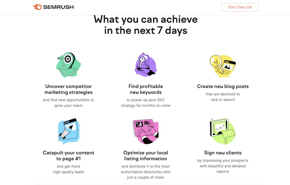
Including social proof no your landing pages can increase the conversion rates by 5%. Social proof shows your audience that others have taken your course or used your products and would recommend it. It is a necessity to design landing pages that convert. The more a visitor sees that others like and benefit from using your product, the more likely they are to convert.
You can leverage different types of social proof, including testimonials, reviews, and press features.
Usually, social proof will appear many times on a landing page, primarily right after the above-the-fold section. Semrush is a great social proof example. You can see they include top companies that use the product, leveraging their brand equity and creating credibility.
Your call-to-action is the most important element of your landing page – that's why you have a landing page. You want someone to sign up for your offer. What it looks like, how it reads, and where it is placed will impact your conversion rate.
Remember, you want to have just one CTA – multiple CTA's reduce the conversion by 226%. A single strong CTA makes it clear to potential customers what you want them to do. Plus, you'll increase your chance of conversion if you are driving them to one goal versus dividing their attention between more than one.
Be brief but clear. Avoid the "submit" and "send" CTA buttons because they are vague. You need to describe exactly what you want from your customers or the next steps—what will happen when they click.
Another element you can capture in your CTA is urgency. For example, this landing page for Nom Nom highlights a special offer to get 50% off and free shipping.
Sun Basket has a CTA button that pops off the page. The bright yellow stands out from the background and it has enough white space around it to draw your attention.
Once your audience completes your CTA, you have one more page to keep their attention and inspire further conversion: the Thank You page.
The Thank You page is the perfect place to introduce your audience to other products you have since you’ve already captured their attention. This could be another CTA asking them to share the content they just signed up for, subscribe to your blog, sign up for your newsletter, attend a live training webinar or even give them a bonus piece of content.
For example, when you download a template from one of Hubspot’s resource landing pages, the Thank You or confirmation page looks like the below. It includes a CTA to learn more about Hubspot software.
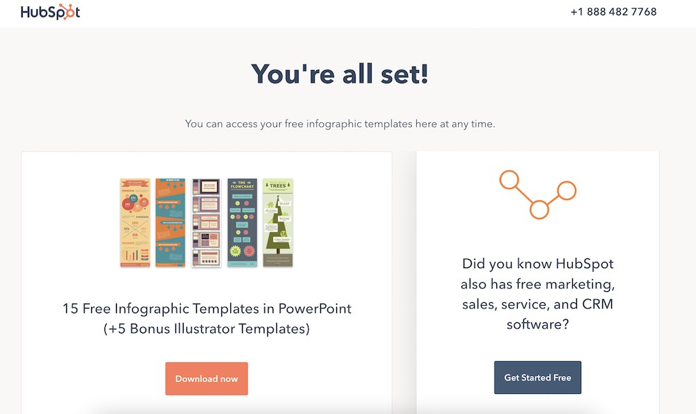
You don’t need to be a web designer or developer to create high-converting landing pages. In fact, there are many do-it-yourself builders, offering an easy user interface plus hundreds of landing page templates to choose from. You can plug these into your existing website and maintain the same user experience site-wide.
Here are a few user-friendly platforms to design a landing page:
If you sign up for Teachable, you can create a landing page for your first course in as little as 10 minutes.
Next, we’ll discuss some simple landing page design elements (color, typography, images) to think about when you’re creating your page to make it even better.
Whichever path you choose, there are still a few things that you need to think about when building your landing page: color, fonts, and images.
It’s the great marketer debate: Does color affect conversion in terms of landing page design?
To keep it as simple, we’re going to discuss a few elements to consider when thinking about colors for your landing page design (and brand).
Every color has psychological implications associated with it. When choosing your landing page color palette, consider what characteristics you want your brand to portray.
Pick colors that are associated with the characteristics you want to exude. If you want to portray luxury and trust, blue and black would be good options. If you want to hint at optimism and health, use yellow and green.
Contrast is important. When two complementary colors are placed next to each other, their contrast is the strongest, and actually makes the colors appear brighter.
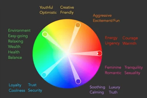
When choosing the palette for your site, make sure to include a color complementary to your page’s main color.
Here are some sites for palette inspiration:
Make sure the colors that you pick are readable. You don’t want a green background with blue text. A helpful hint is to use a light background with dark text.
If you’re designing your own landing page from scratch, you have to pick your own fonts. The best practice is to stick with commonly used Google web fonts like:
Using these fonts ensures that the majority of browsers and operating systems render your text correctly. Plus, it’s much easier when sending newsletters and dealing with different email service providers.
When choosing fonts, stick to one font to reduce the clutter on your landing page. Each of the fonts above has bold and italic styles, which are simple ways to differentiate text. Also, make sure you have the proper licenses to use these fonts for your business.
Another way to differentiate text is with size. A study by Wichita State found that body text is best at 12pt because it’s the easiest to read in the least amount of time. If your audience is older, bumping up the point size to 14 may make it easier on the eyes. Headlines look best at 17 to 25pt.
In that same Wichita State study, it was discovered that any font, larger or smaller than 12pt, decreases readability. If you want someone to spend time reading your copy, try enlarging the size in the testimonial section or reducing the size for the money-back guarantee statement.
The last size factor to consider is line spacing. Make sure there is enough space between each line to give the text room to breathe and be read easily.
Earlier, we explained the importance of having an image of your product. Now we’ll go into more detail on how to choose an image and its importance to landing page design.
Most importantly, you want the image to add to your landing page, not detract from your message. Include a clear, high-quality image that is not busy.
Think about how the text will look on top of the image. If your image has a lot going on, consider darkening it up with Photoshop. This way, the text will be easier to read.
A quick hack is to add a dark rectangle over the photo and reduce the opacity. The image should be dark enough for the text to be readable.
Once you’ve created a landing page, be sure to double check it on mobile devices, which is often where traffic comes from.
With these landing page design tips, you’ll be well on your way to understanding how to convert customers. Test out a few different landing page designs first and A/B test each to see how it performs. Your first version can always be refined after you have some data to understand how users interact with your page. If you are creating a landing page for a course, you can get started easily with Teachable’s sales page template.
The best way to understand the secret to building successful landing pages is to see all these practical tips we discussed today brought to life. So, let's take a look at a few powerful landing page examples:
This is an excellent example of a click-through landing page.
A strong headline, a quick subhead explaining the most important thing, and a very clear CTA to type your email address and get a free trial of the software.
Lower down the page, it has social proof and an FAQ section addressing the most important questions and concerns people might have, which all add to a very simple yet effective landing page design.
Ali Abdaal's landing page for his bestselling book Feel Good Productivity takes the landing page design to the next level. The landing page design is simple, yet effective and super interacting with all the visual element playfully moving through the screen as you scroll down, without impacting the load speed or responsiveness.
This landing page has a strong headline, video explainer, testimonials from industry experts, and very clear CTA's inviting you to buy the book at the very top and bottom of the landing page.
Pat Flynn's online course landing page is very modern and simple, and it captures the visitor's attention immediately. The headline and subhead tell you everything you need to know about the course, and the video explainer is engaging and enticing. There is a very clear CTA, testimonials, and even an FAQ addressing any questions people might have about joining his online course.
It's worth putting in the effort in your landing pages for free training, and Jenna Kutcher is a great example. Her free email-building training landing page is informative and engaging and has the best personalized CTA right at the beginning of the page. While there is no explainer video, there are visual assets like videos and images of Jenna, which make the design high-quality and professional.
Another phenomenal free-training landing page example is for Mel Robbins's 2-part video training. Right at the very top of the landing page, you see the benefits you'll gain from taking part in this training. Next to it, there is a video explainer, that's informative and engaging. The CTA is clear and simple and takes less than a few seconds of people's time.
This landing page (below) was quite long. The top “above-the-fold” section offers an easy way for customers to sign up (the CTA), alongside descriptions of what exactly is included in the online course. Further down the page are video testimonials (social proof), an overview of the modules, and buttons to reinforce the CTA.

As you’ll see on Kourtney Kardashian Barker’s new online shop of herbal vitamins, this landing page has bright, eye-catching images and a few different CTAs—the dominant invitation being to “Shop All”. As you navigate to individual products, you’ll find social proof, more easy-to-digest information about ingredients, and more.
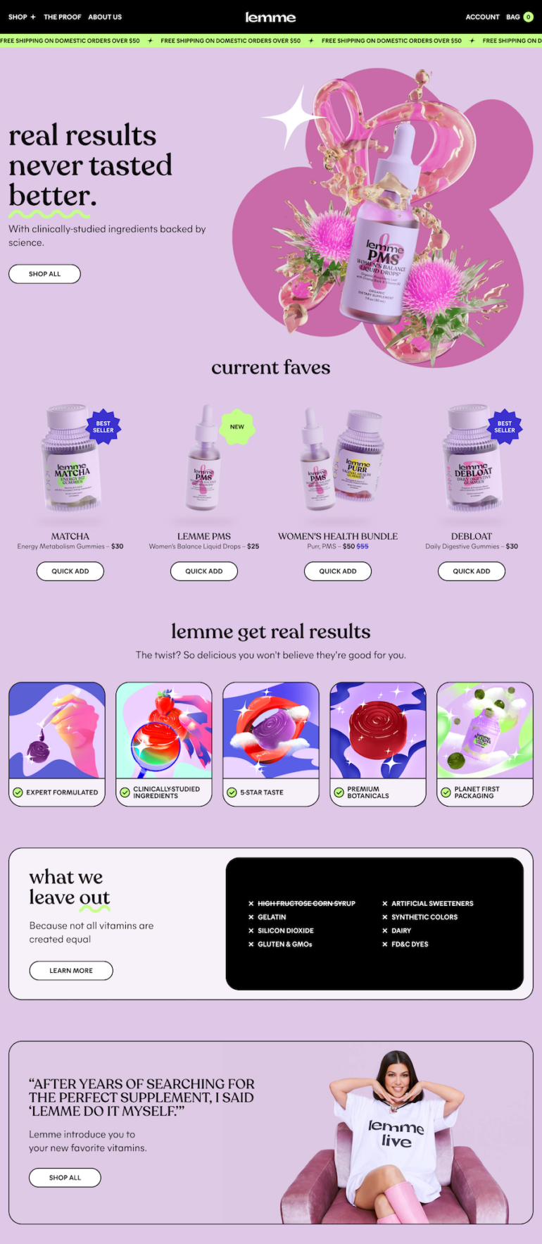
When it comes to real estate, the images are often front and center. You’ll notice this example doesn’t even have a heading or subheading. The benefits are the features of the home, which can be found in the descriptive paragraph and the charts above the CTA button.
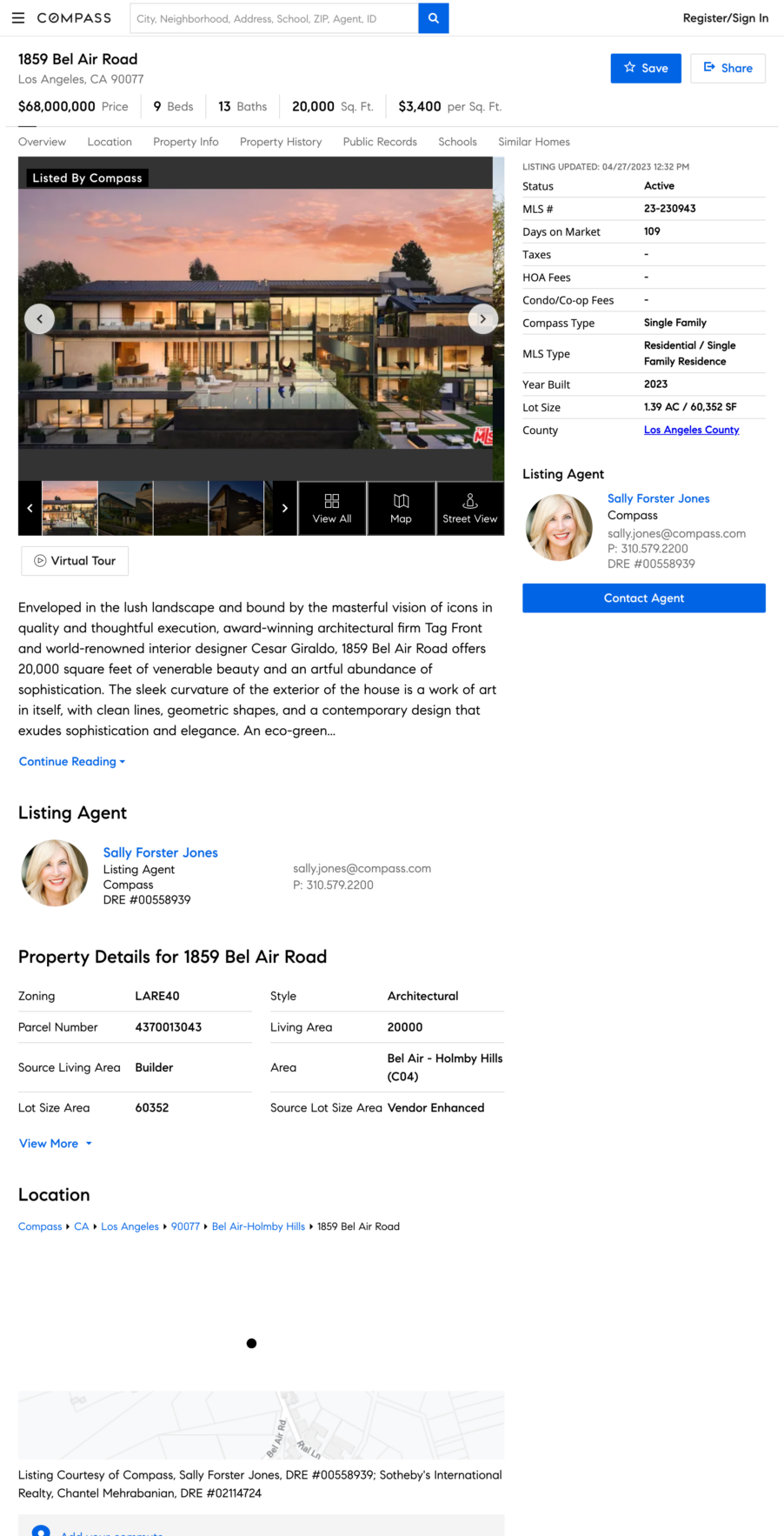
Here is an example Unbounce recognizes as effective because of how it speaks to a specific target audience (women entrepreneurs in the digital space). Meanwhile the design treatment above the CTA bar highlights incentives to sign up: watch anytime, many experts featured, and free.
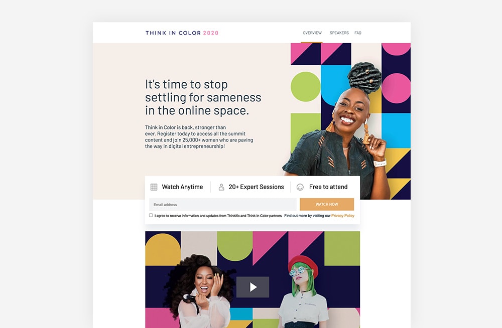
Popular website builder Wix uses a pop-up to capture visitor information, while all of the benefits remain in the background on the landing page. The CTA button clearly indicates that there is no harm, risk, or commitment to trying: “Start for free.”

While this webinar, hosted by Mailchimp, doesn’t have a main image (just headshots of the speakers), the branding is consistent with the email and marketing platform. From the headline (and lack of subheading), it’s clear that the intended audience is MailChimp users. Meanwhile, the landing page offers two actions: to sign up or spread the word.
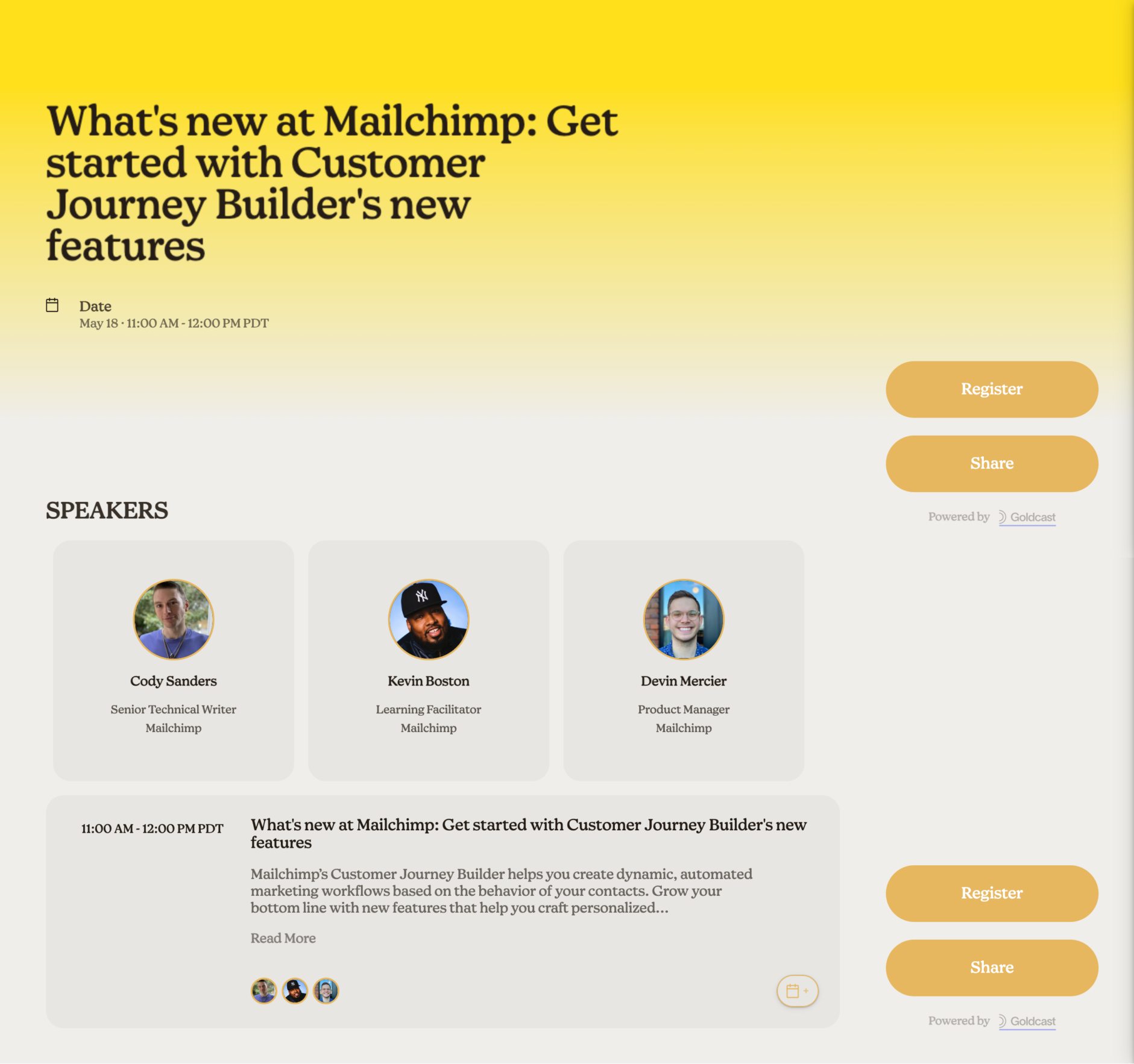
Whether you’re about to launch a course or enrollment has already closed, you can still track interest and capture site visitors’ information. Here’s an example of Kris Carr’s membership container, Thrive Bootcamp.
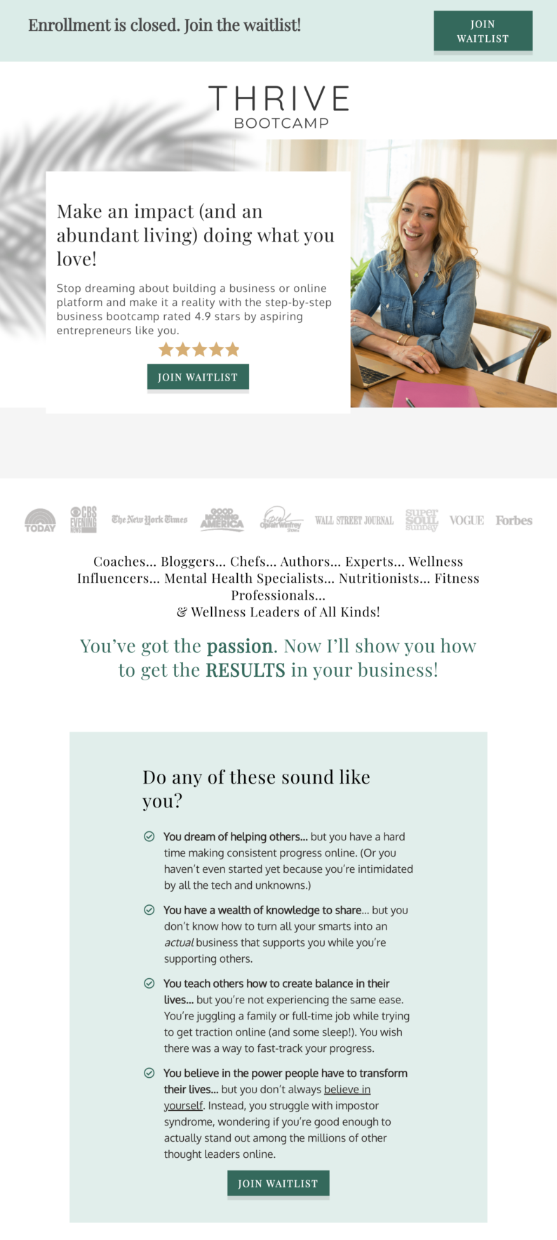
SaaS stands for “software as a service” and allows customers to access applications over the internet through cloud-based delivery. This landing page example features the six key components in a fluid (and effective) way.
Once your landing page is live, your landing page analytics will be your best friend. Through analytics, you can learn what works and what doesn't, and you can get a better look at your audience's behavior. By analyzing your analytics, you'll be able to improve and reap better results for your business.
Here are some of the most important metrics you want to pay attention to when it comes to analytics and optimizing landing pages:
The two most common landing page challenges businesses face are high bounce rates and low conversion rates. If you're also facing these challenges, don't be alarmed – we have landing page solutions for every challenge you might face.
On average, landing pages have a bounce rate of between 70-90%. Obviously, you want to keep your bounce rate at the lower side of things because if you have a high bounce rate, it means that something on your landing page is not working for people. It could be a marketing problem – you're attracting the wrong people, so they bounce quickly. Or, it could be an indication that you need to improve your landing page design.
So, consider tackling the issue at hand in small steps. First, review your marketing efforts and see if your social media promos, and paid advertisement is driving the right people to your landing page. If you find that you are targeting the right people, then it's time to take a look at your landing page design.
Consider tweaking small elements like headlines and your visuals (include visuals if you have none), and review your CTA's – are they clear? Is there more than one? Make sure your copy is easy to read and digest. Utilize the white space and simplify your landing page design.
The average landing page conversion rate across all industries is 4.3%. A good conversion rate is anything above 10%. If you notice your conversion rate to be low, don't get discouraged – there are plenty of things you can do to change that.
One thing that could compromise your conversion rates is your CTA. So, the first thing you want to do is review your CTA's – is there one clear CTA or multiple ones? Is the CTA personalized or general? Does your CTA stand out, or does it get lost amongst other design elements on your landing page?
Once you review your CTAs and make adjustments where needed, you should see an increase in your conversion rates. If not, then consider looking into your submission form, especially if you notice high form abandonment rate. Remember, the more information you ask in the sign up form, the less likely people are to sign up. Maybe it's worth simplifying your submission form to minimize the obstacle.
Alternatively, you might need to reconsider your offer. Maybe it's not clear enough, or maybe you need to find a different angle to convince people why they should sign up for your offer, and how much value they'll get from it if they do sign up.
Ready to boost your business with high-converting landing pages? With Teachable, you can easily create pages for your learning products. Sign up for a free Teachable account today and get access to powerful tools and resources to help you design pages that drive sales and capture leads. Start now!
A landing page is different from a homepage. A homepage is designed to appeal to multiple audiences and convey information to anyone interested in your overall brand. A landing page, on the other hand, is defined as a single page with a specific target—getting visitors to complete an action. The name “landing page” comes from the idea that people will land on it from somewhere else, usually a digital ad or another marketing campaign.
Your landing page design needs to speak to your target audience and drive them to your call-to-action (CTA). Everything on a landing page from copy and images to layout should support that one goal.
There are six main components that make a landing page successful. These six components need to work in cohesion together to create a high-converting landing page:
The elements of a landing page, including copy and graphics, should be intentional and specific to the goal (CTA) or offer. Your text needs to be captivating, persuasive, and above all else, clear. You don’t want your audience to be confused about what you are telling them or what they are getting from being on your page.